If you’ve ever written a great marketing email, you already know how to write a great sponsorship email. The same principles apply: clarity, relevance, empathy, and a strong sense of value. There’s no magic trick, just a few key ingredients that, when combined thoughtfully, create results.
And before you get hung up on industry or format — don’t. Whether you’re in automotive or education, digital marketing or human resources… whether you’re promoting an in-person event, an online summit, or a simple newsletter sponsorship, the fundamentals are the same.
Below you’ll find real-world examples from a range of organizations offering sponsorship opportunities in all shapes and sizes. Some are scrappy startups, others are household names. Even if their industry has nothing to do with yours, you can learn from what they did well, and from what they could have done better.
Once you’ve looked through the examples and taken notes on what makes each one tick, move on to how to write a sponsorship email. And don’t miss the template at the end. It’ll help you turn inspiration into execution.
Table of Contents
- Samples of Sponsorship Emails
- How to Write an Email for Sponsorship
- A Tried-and-Tested Sponsorship Email Template
Free Sponsorship Proposal Template
This sponsorship proposal template will help you get the partnerships you need.
- Project Description
- Cover Letter
- Sponsorship Levels
- And More!
Samples of Sponsorship Emails
Find 10 samples of real sponsorship emails below. Each example includes a quick critique: what worked, what didn’t, and a bottom-line takeaway you can use to sharpen your own outreach. Think of it as an email autopsy, but a friendly one that you can learn from.
And yes, these are all real emails that landed in my inbox. As someone who runs a small consultancy, I’m careful about where I spend my marketing dollars. You really have to make the case to entice me. I won’t name names, but I didn’t take advantage of every opportunity here — though I did follow through on one. So, if you can craft a sponsorship email that wins me over, congratulations; you’re officially in the top 10% of people pitching sponsorship.
1. Ad Age
From: Ad Age
Subject Line: 2026 A-List & Creativity Awards: New categories…
Preheader Text: Celebrating industry excellence
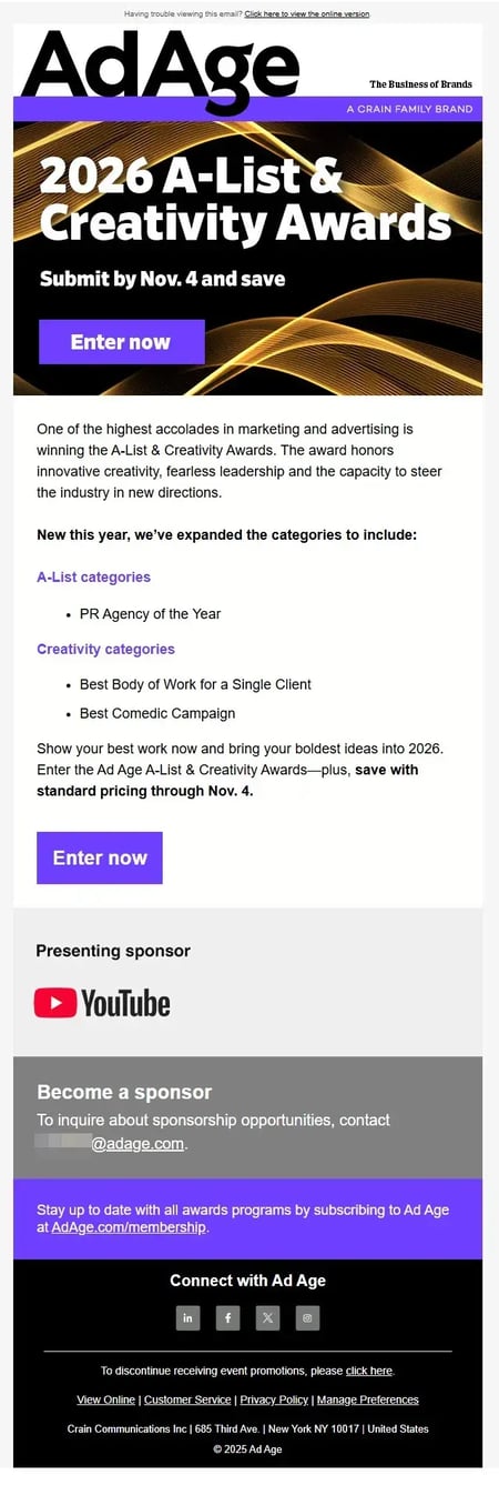
What Works Well
- Instant brand authority. The Ad Age name alone carries weight in the marketing and advertising world. That brand equity instantly establishes credibility; no need for a long introduction. If you’re reaching potential sponsors, starting from a place of trust and prestige is a big advantage.
- Visual strength and polish. The design communicates premium value: strong color contrast, bold typography, and clear hierarchy. Visually, this screams “high-end industry event.” That helps sponsors feel confident they’d be aligning their brand with something credible and high-caliber.
- Built-in social proof. YouTube’s logo as “Presenting Sponsor” does a lot of heavy lifting. It signals that top-tier brands have already invested in this program, a strong psychological nudge for other potential sponsors who want to associate themselves with that level of prestige.
- Implied alignment with the audience. Even though the main copy focuses on award submissions, the target audience overlaps perfectly with sponsor prospects: agencies, creative leaders, and marketing decision-makers. In other words, the right people are seeing this, even if the messaging doesn’t fully speak to them yet.
Opportunities to Improve
- Sponsorship callout is buried. The “Become a sponsor” line appears at the very bottom, visually and contextually detached from the main message. For sponsors to convert, visibility and context are everything. Pulling that section up (perhaps as a mid-email block) would give it a fighting chance of being seen.
- No value proposition for sponsors. The email never answers why someone would sponsor. What visibility, reach, or prestige do they gain? Even one sentence like “Sponsors gain visibility across Ad Age’s 1M+ marketing professionals” would create instant relevance.
- CTA is too transactional, too soon. “Contact @adage.com” assumes readiness. Most prospects won’t jump from awareness straight to outreach. A “Learn more about sponsorships” link or button leading to a landing page would catch those who are curious but not yet committed; nurturing, not pushing. Got an effective CTA? .
- Lost opportunity for emotional or strategic framing. The awards celebrate “fearless creativity,” but the sponsorship section feels purely administrative. Framing sponsorship as a way to champion creativity or celebrate innovation alongside the industry’s best would tie the message back to the event’s purpose. Right now, the alignment is implicit, not persuasive.
- No visibility promise or proof points. Sponsors want measurable exposure like logo placements, audience size, event impressions, and media mentions. A quick bullet or two summarizing those benefits (even in broad strokes) would turn curiosity into consideration.
- Missed timing urgency. While there’s a strong sense of urgency around award submissions (“Submit by Nov. 4 and save”), the sponsorship section lacks any time-sensitive incentive. Something like “Limited sponsorship packages available” or “Align your brand before judging begins” could give potential sponsors a reason to act now.
Bottom Line
As a sponsor recruitment email, this one barely scratches the surface of its potential. It benefits from Ad Age’s brand prestige and built-in audience alignment, but the sponsorship content is an afterthought; visually minimized and emotionally disconnected from the award narrative.
To reposition this for sponsors, it needs:
- Earlier placement and stronger framing (aligning sponsorship with celebrating creativity).
- A clear, enticing value statement (what sponsors get).
- A low-barrier call-to-action (CTA) (link to learn more, not just an email address).
With those small but strategic adjustments, Ad Age could turn an awards promotion into a dual-purpose engine. One that not only drives entries but also quietly fills next year’s sponsorship pipeline.
2. DigiMarCon
From: America Events
Subject Line: Sponsorship, Exhibiting & Advertising Opportunities
Preheader Text: DigiMarCon stands as the annual convergence point for Top Brands, Agencies, Publishers, and Technology

What Works Well
- Professional polish and structure. The email immediately communicates legitimacy, both in tone and presentation. The headline, subhead, and sender all align to signal that this is a serious, established event rather than a one-off sponsorship grab.
- Strong scannability through formatting. Short paragraphs, generous spacing, and clearly defined subheads (especially “Why should you consider sponsoring…”) make the message easy to digest. The orange subheads (“Targeted Audience Reach,” “Brand Visibility,” etc.) create visual rhythm and help readers skip to what matters most to them.
- Benefit-driven content hierarchy. This email does an excellent job of layering persuasion. The first few paragraphs establish credibility and context; the bullet-style benefits deliver proof points; and the closing paragraph circles back to the emotional payoff (“Let’s make an impact together”). That flow feels intentional and effective.
- Comprehensive value proposition. It covers nearly every angle a potential sponsor cares about: reach, visibility, networking, lead generation, content value, and even competitive advantage. That breadth gives it weight and shows that DigiMarCon understands sponsor motivations from multiple perspectives.
- Human opening. Starting with “Hi Jeanne,” personalizes what could otherwise feel like a corporate broadcast. It’s a small touch, but it softens the tone just enough to make the outreach feel more one-to-one.
Opportunities to Improve
- Length and cognitive load. Even though it’s well-organized, it’s long. There are ten benefit sections; each valid, but collectively overwhelming. For email, brevity wins. DigiMarCon should consider grouping benefits into 3–4 categories (e.g., “Visibility,” “Networking,” “Lead Generation,” “Industry Authority”) and linking to a detailed landing page for the rest. That keeps engagement high without fatiguing the reader.
- Missing visual storytelling. This is an all-text email aside from the header and footer. Given the nature of DigiMarCon (visual, tech-savvy, global), the lack of imagery is a missed opportunity. A few conference photos, sponsor logos, or even an infographic of “40 cities / 18 countries / 10K+ attendees” could make it feel more dynamic and credible.
- CTA copy could be more persuasive. The button text (“SPONSORSHIP & EXHIBITING OPPORTUNITIES”) is factual but not motivational. A CTA like “Explore Sponsorship Packages” or “Let’s Discuss Your Brand’s Fit” would better match the conversational tone of the body.
- From address and sign-off lack personality. The from address, “American Events,” and the sign-off, “The DigiMarCon Team” are both fine, but making this from a named contact (e.g., “Sarah Kim, Global Partnerships”) would increase authenticity and encourage replies. Sponsorship inquiries often require conversation, not just clicks, so inviting that personal dialogue matters.
- A touch too self-promotional. While the benefits are strong, nearly every paragraph starts from their perspective (“Our Exhibition Hall…,” “Our events attract…”). A more audience-centered rewrite would subtly flip that: “As a sponsor, you’ll gain direct access to…” This simple shift reframes the pitch around the reader’s goals, not the organizer’s achievements.
Bottom Line
This is a polished, professional sponsorship email that earns credibility through structure, clarity, and comprehensiveness. It reads like it was written by marketers for marketers, and that’s a good thing.
To elevate it further, I’d trim about 30% of the text, integrate visuals that prove scale and energy, and humanize the CTA and sign-off. Those small refinements would transform it from a solid “information-rich” email into a conversion-optimized one.
Free Sponsorship Proposal Template
This sponsorship proposal template will help you get the partnerships you need.
- Project Description
- Cover Letter
- Sponsorship Levels
- And More!
3. Email Innovations World
From: Paul Gillis, Email Innovations World
Subject Line: Partnership Opportunities at Email Innovations World 2025
Preheader Text: Join industry leaders shaping the future of email marketing — explore custom sponsorship options designed for your goals.
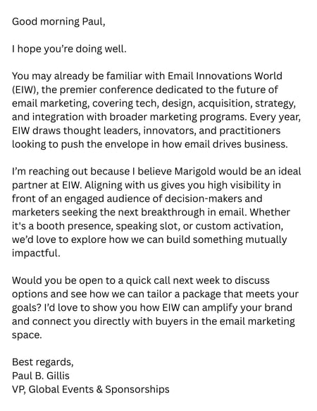
What Works Well
- Professional, confident tone. This is one of the most polished sponsorship outreach emails in the group. The tone strikes the right balance between formal and conversational; professional enough for a VP-level sender, but still approachable. There’s no hype, no gimmicks. It reads like a real person reaching out to build a partnership.
- Strong credibility framing. The description of Email Innovations World (EIW) immediately establishes legitimacy. The phrasing “premier conference dedicated to the future of email marketing” sets expectations well. It situates the event within the industry landscape and signals prestige without overselling.
- Personalized and relevant. Mentioning Marigold by name early in the message makes the outreach feel tailored. It suggests some thought went into selecting the recipient, that this is not a generic mass pitch. That small personal touch dramatically increases the likelihood of engagement.
- Clear articulation of value. The middle paragraph effectively explains what’s in it for the sponsor: high visibility, an engaged audience, and flexibility in how to participate (“booth presence, speaking slot, or custom activation”). It conveys opportunity without overwhelming detail, a good balance for an introductory touchpoint.
- Polite and actionable close. The invitation to a “quick call next week” is phrased with courtesy and leaves the door open. It’s specific enough to prompt a response but not presumptive.
Opportunities to Improve
- Missing a link to the event website. This is the biggest miss. Including a link to the EIW site or sponsorship overview page is a low-effort, high-impact improvement. It gives recipients something to explore on their own terms, even if they’re not ready to schedule a call. Something as simple as making the first mention of Email Innovations World a link to the site would build credibility and provide a path for self-qualification.
- Front-load the EIW description. The first paragraph is well-written but slightly long. Breaking it into two shorter lines or leading with the event’s core differentiator (e.g., “the only global conference focused exclusively on email innovation”) would make the value clearer faster, especially for busy execs who skim.
- Add a light proof point. Including one credibility stat or name-drop would make the opportunity feel more tangible. For example:
“Last year, 1,200+ marketers attended from brands like Adobe, Oracle, and Intuit.”
That single line gives context for scale and audience quality, key data for sponsorship decisions.
- Offer a softer secondary CTA. Not every recipient is ready for a call, so a secondary CTA like “Would you like me to send the sponsorship overview deck?” gives them an easier way to engage. It’s still a next step but requires less immediate commitment.
- Minor clarity tweak in the close. The phrase “I’d love to show you how EIW can amplify your brand and connect you directly with buyers” is good, but slightly heavy on the “sales” tone. Reframing as “I’d love to explore how EIW could help you connect directly with decision-makers in the email marketing space” keeps it collaborative and is in keeping with the rest of the message’s tone.
Bottom Line
This is a strong, well-composed sponsorship outreach email, arguably one of the best of the batch. It feels professional, authentic, and respectful of the reader’s time.
To make it even more effective:
- Add a direct link to the EIW website or sponsor overview.
- Include one proof point (scale, audience, or past sponsors).
- Offer an optional next step for those not ready to jump on a call.
- Tighten the opener slightly for faster engagement.
These are subtle refinements, not fixes. With them, this email would hit the sweet spot between polished professionalism and approachable partnership outreach.
4. Georgetown University
From: Georgetown Entrepreneur Alliance
Subject Line: Georgetown Entrepreneurship Summit registration now open!
Preheader Text: To view this email as a web page, go here. Georgetown Entrepreneurship Alliance Entrepreneurial Excel…
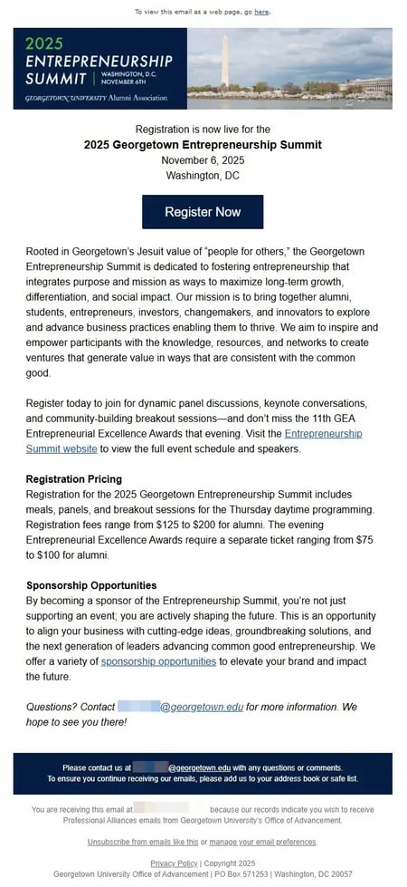
What Works Well
- Built-in brand authority and credibility. Georgetown University immediately conveys prestige, trust, and influence; it’s a dream foundation for sponsorship outreach. Sponsors want to align with respected institutions, and Georgetown’s mission-driven reputation (“people for others”) signals integrity and social impact; a strong positioning lever for corporate partners.
- Clear alignment with sponsor values. The message frames the Summit around purpose, mission, and social good. That’s gold for sponsors seeking brand alignment with innovation, education, or impact. It suggests this isn’t just another conference; it’s a platform for shaping the next generation of socially conscious leaders, a sponsor’s dream narrative.
- Dedicated sponsorship section. Unlike many “registration-first” emails that tuck sponsorship into a sentence at the bottom, this one gives it a headline and its own paragraph. That structure signals legitimacy; this is a formal program, not an afterthought.
- Effective emotional framing. The line “you’re not just supporting an event; you are actively shaping the future” positions sponsorship as participation in a movement, not a transaction. That kind of aspirational language is persuasive; it reframes the ask as an opportunity to lead.
- Smart use of a landing page link. Including a link to “sponsorship opportunities” is a best practice. It gives interested readers a low-pressure way to learn more before reaching out, capturing mid-funnel leads that might otherwise bounce.
Opportunities to Improve
- Focus and balance. It’s not a bad idea to include both registration and sponsorship information in the same email; they can complement each other when done well. After all, some potential sponsors may also attend the event, and vice versa.
But balance is key. If sponsorship is tucked away below pricing and logistics, it’s effectively invisible. At that point, you might as well save it for a dedicated follow-up.
To make the dual-purpose approach work, give sponsorship comparable real estate: a headline, a short benefit-driven blurb, and a clear “learn more” CTA. That way, both audiences, attendees and sponsors, feel seen and served.
- Lack of specific sponsor benefits. The current copy appeals to emotion but doesn’t describe tangible outcomes. Sponsors need to see value exchange: audience reach, branding exposure, networking access, or media visibility. Even three short bullets like:
- Reach 500+ entrepreneurs, investors, and alumni innovators.
- Be recognized in all pre-event and on-site materials.
- Position your brand alongside Georgetown’s global business network.
…would instantly make this feel like a business opportunity, not a goodwill gesture.
- Hidden CTA and weak visual hierarchy. The sponsorship link is text-only; it’s embedded mid-paragraph. It’s easy to miss. A visually distinct button (“View Sponsorship Packages” or “Partner With Georgetown”) would make the opportunity actionable and signal importance.
- No sponsor social proof. There’s no mention of prior sponsors, creating a major credibility gap. Including even one name or category (“Previous sponsors include Deloitte, PwC, and Capital One”) would reassure prospects that they’d be in good company.
- No urgency or exclusivity cue. Sponsors respond to scarcity. Even soft phrasing like “Limited sponsorship tiers available” or “Early partners receive priority branding” would nudge readers to act sooner. Right now, it’s entirely open-ended, which often translates to “I’ll think about it later.”
- Tone skewed toward mission, not marketing. The language leans heavily academic and altruistic, which fits the Georgetown brand but risks underselling the marketing upside. A great sponsorship email balances both: the purpose (impact, education, leadership) and the practicality (visibility, reach, brand equity).
Bottom Line
As a sponsorship email, this piece has a strong foundation: trust, mission, and emotional resonance. But it buries the lead. It talks about the event rather than to potential sponsors.
With a few structural and content adjustments, it could easily become a top-performing sponsorship outreach:
- Lead with the partnership opportunity, not registration.
- Add clear, quantified sponsor benefits.
- Surface the CTA visually and add light urgency.
- Sprinkle in social proof or past sponsor examples.
Right now, this is a beautifully written event invitation that mentions sponsorship. With a shift in framing and hierarchy, it could become a compelling sponsorship pitch that happens to mention an event.
5. Georgetown University (again)
From: Tony Kinslow, VP and Chief Human Resources Officer
Subject Line: Eileen Fenrich “Sponsor a Family” Program 2024
Preheader Text: To view this email as a web page, go here. Dear Colleague, The Department of Human Resources…
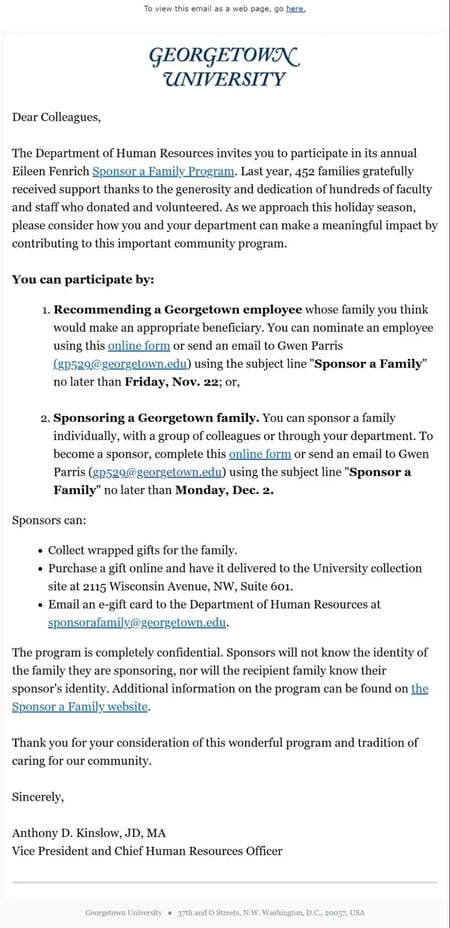
What Works Well
- Mission-driven authenticity. The message leans beautifully into Georgetown’s Jesuit ethos of community and service with “people for others.” That positioning immediately sets an emotional tone sponsors respond to: generosity, empathy, and collective good. It’s clear this isn’t just about giving gifts; it’s about belonging to a values-based culture.
- Clarity of participation options. The “You can participate by” section is one of the strongest structural elements. Listing two clear paths (nominate or sponsor) with direct links and deadlines reduces friction and increases action. The formatting makes it easy for readers to scan and self-identify which role fits them.
- Step-by-step instructions. Each action includes exactly what to do, who to contact, and when; this is a level of specificity many sponsorship appeals miss. That logistical transparency builds trust and makes participation feel easy, not intimidating.
- Personal and institutional credibility. Signed by a senior leader (the VP of HR), the message carries authority while maintaining warmth. The personal signature reinforces sincerity and accountability, two qualities essential for any ask involving generosity.
- Tone of gratitude and community. The language (“thank you for your consideration,” “tradition of caring”) reflects appreciation rather than pressure. That’s ideal for internal sponsorship requests, which rely more on goodwill than on incentives.
Opportunities to Improve
- Visual hierarchy and engagement. The email is entirely text-based and feels visually flat. A banner image of past participants or wrapped gifts would immediately humanize the cause and stop the scroll. Even simple visual cues, think bolded deadlines, icons for steps, or a color-blocked CTA button, could lift engagement dramatically.
- Missed opportunity for emotional storytelling. The copy mentions that “452 families gratefully received support last year.” This is a wonderful stat, but it stops there. A one-sentence story or quote (“One staff member shared, ‘This program made my children’s holiday magical’”) would make the impact tangible and unforgettable.
- No central CTA button. The links are embedded in text and repeated several times (good for clarity), but none are visually distinct. A button like “Sponsor a Family Today” or “Nominate a Colleague” would give readers a clear visual endpoint and help the main action stand out from secondary details.
- Slightly dense middle section. The dual lists (how to participate, how to deliver gifts) are functional but long. Collapsing them into fewer bullets or converting them into a mini “How it Works” flow could improve readability.
- Limited reinforcement of collective impact. The copy is very one-to-one (“you sponsor a family”), but could be elevated by including scale. For instance, “Together, Georgetown employees supported 450 families last year; let’s reach 500 this year.” That communal framing is motivational and creates shared purpose.
Bottom Line
This is a heartfelt, credible, and well-structured internal appeal that already does most of the heavy lifting with clear steps, trusted voice, and emotional alignment. But as a sponsorship-style communication, it could benefit from a stronger visual cue system and a touch more emotional storytelling.
With a few small adjustments, think an image, a single strong CTA button, and a human story or stat, it would move from a polite internal memo to a mobilizing sponsorship appeal that inspires immediate participation.
6. LeadGen Insider
From: LeadGen Insider
Subject Line: Jeanne, Promote Your brand to 20,000 Lead Gen Professionals Year Round! ?
Preheader Text: &濒迟;丑迟迟辫蝉?..虫办蝉谤尘.蝉迟谤颈辫辞.肠诲苍.别尘补颈濒/肠辞苍迟别苍迟/驳耻颈诲蝉/颁础叠滨狈…

What Works Well
- Immediate positioning and relevance. The first sentence establishes exactly what this email is about: sponsorship and exposure to 20,000 prospects. There’s no warm-up, no fluff. That directness is perfect for B2B readers who want to know “what’s in it for me” within the first scroll.
- Quantitative credibility. Listing the audience size (19,500 subscribers) and open rate (21%) is a standout move. It gives potential advertisers a way to do quick ROI math, something that’s rarely included but deeply persuasive. Transparency builds trust, especially in digital advertising where performance claims are often vague.
- Tiered pricing upfront. Showing the ad rates ($795, $395, $295, $1,395) filters out mismatched prospects early, saving time for both sides. It also communicates confidence; they’re not afraid to lead with numbers because they know their audience and value. For sponsors with budget authority, that clarity is refreshing.
- Visually descriptive examples. The inclusion of newsletter screenshots and placement mockups is excellent. It helps prospects visualize exactly where their content would appear and how it integrates with the publication, lowering the barrier to saying “yes.”
- Proof of traction and urgency. The note that they “added 1,000 new subscribers last week” and that “ad spots are flying off the shelf” adds both momentum and scarcity. Used judiciously, that’s effective FOMO messaging in a B2B context.
Opportunities to Improve
- Visual and tone cues signal “AI-written.” The use of emoji-style icons (?, ?, ?, etc.) and slightly exaggerated phrasing (“Ad spots are flying off the shelf!”) make this sound . That’s risky for a B2B brand positioning itself as a thought leader; the tone could undermine credibility with seasoned marketers. A more authentic, data-driven voice would better suit the audience.
- Length and cognitive overload. This email tries to do everything: explain the offer, build urgency, list benefits, share examples, show metrics, and present pricing. It’s simply too long for a first touch. The detailed rate card and visuals would be more effective on a landing page or microsite, with this email serving as a teaser and click-driver.
- Information hierarchy issues. The key selling point, reach and audience quality, is buried halfway down. A more effective structure would front-load that data (“19,500 decision-makers in the lead generation industry, 21% open rate”) immediately after the intro to anchor credibility early.
- Too many competing CTAs. The email invites the reader to “Check out our rate card,” “Reply to save your spot,” and “Contact us.” Too many CTAs splinter focus. Pick one core action (e.g., “View Full Sponsorship Packages”) and support it visually with a single standout button.
- Branding imbalance. The email’s upper section does a strong job establishing the LeadGen Insider identity, but the second half becomes overly promotional, with cluttered visuals and repetitive headers. This creates “scroll fatigue.” Tightening the layout and cutting 30% of the content would keep energy high to the end.
- Missing qualitative proof. We see quantitative proof (open rate, subscriber count), but no qualitative proof; no testimonials, advertiser quotes, or results. Even one line like “Our advertisers see an average CTR of 4.2% and strong referral traffic to landing pages” would substantiate the value beyond vanity metrics.
Bottom Line
This is a bold, high-transparency sponsorship offer, and that’s commendable. Few brands lead with real numbers and prices, and it positions LeadGen Insider as confident, data-savvy, and no-nonsense.
But the email’s length, tone, and visual choices dilute that professionalism. To improve performance and perception:
- Refine the tone — less hype, more authority.
- Front-load data and audience insights.
- Move detailed pricing and mockups to a landing page.
- Add a single, clear CTA button (e.g., “View Sponsorship Packages”).
Done right, this could become a stellar example of a B2B sponsorship email that blends credibility and clarity — without veering into “AI ad pitch” territory.
Free Sponsorship Proposal Template
This sponsorship proposal template will help you get the partnerships you need.
- Project Description
- Cover Letter
- Sponsorship Levels
- And More!
7. Radnor Educational Foundation
From: Radnor Educational Foundation
Subject Line: REF Sponsor and Donor Opportunities Available for School Year!
Preheader Text: Reach Radnor Households and…

What Works Well
- Authentic, heart-centered imagery. The photos of smiling children and community interaction instantly establish emotional connection, always a good move for education or nonprofit appeals. These images do the heavy lifting of humanizing the ask.
- Clear and direct CTA. “Contact Us” and the visible website URL make the next step simple and unmistakable, no guessing required. That’s essential for sponsor outreach, where friction often kills follow-through.
- Short, digestible copy. The message stays focused, delivering who they are, what they need, and who benefits. It respects the reader’s time, which is especially important when targeting local businesses or busy professionals.
- Community relevance. The emphasis on “Radnor households” and “youth development” speaks directly to local pride and shared purpose. This is smart targeting for a community-based sponsorship appeal.
Opportunities to Improve
- All-image format. The entire email appears to be image-based, which means it risks accessibility issues (no alt text for screen readers) and low deliverability. Many email clients block images by default, so if the visuals don’t load, the message disappears entirely. Adding HTML text, even just the headline and CTA, would boost performance and readability. Even better: making everything they want people to read rich text.
- Branding could be stronger. The logo appears in the header, but without accompanying text, brand recognition may falter, especially for recipients unfamiliar with REF. Including the full organization name in the header, or at least the initials (REF) would build trust and reinforce identity. And yes, this is true even though the brand name is in the friendly from line. Plus, doesn’t it just look odd with just the logo?
- Limited sponsor value proposition. While the community benefit is clear (“students will benefit”), the sponsor benefit is not. There’s no mention of sponsor recognition, like where logos appear, how sponsors are thanked, or what visibility they gain. That’s key information for businesses deciding whether to invest. Even a short line like “Sponsors are featured in school newsletters, community events, and social media shout-outs” could dramatically strengthen the pitch.
- Visual hierarchy. The layout leans heavily on circular images and bold shapes, but the eye doesn’t have a single focal point. Reordering or resizing sections could improve scannability, for instance, leading with the core ask (“Help Fund Innovation for 3,600 Students”) and following with the CTA.
Bottom Line
This email succeeds in heart and clarity; it feels genuine, local, and mission-driven. But from a marketing performance standpoint, it’s missing a few essentials that turn interest into commitment: accessible formatting, stronger brand presence, and a clear articulation of sponsor value. With those refinements, this could go from good community appeal to high-performing sponsorship recruitment email.
8. Thomson Reuters
From: Amin, Krina (Reuters)
Subject Line: CXOs at Goldmans, Citi, MasterCard join Reuters AI in Financial Services NY
Preheader Text: Hi Jeanne, getting in touch as we have our last remaining sponsorships for Reuters AI in Financial…
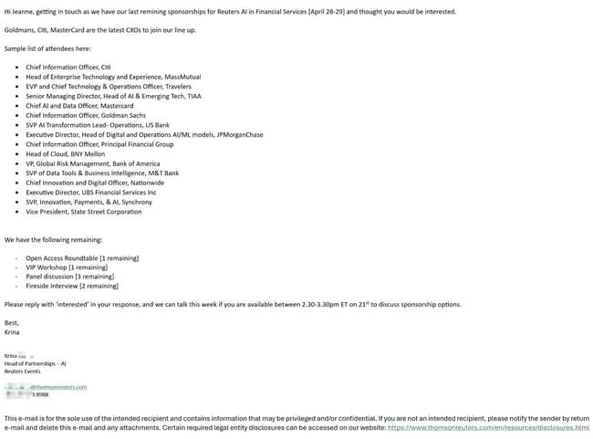
What Works Well
- Credibility by association. The inclusion of the Reuters name automatically adds gravitas. It’s a globally respected media brand, so the message benefits from institutional authority, assuming the recipient believes it’s authentic (more on that below).
- Social proof through attendee list. This is the strongest part of the email. Listing specific titles and organizations (CIOs, SVPs, and heads of AI from Citi, Goldman Sachs, Mastercard, etc.) is an incredibly effective trust builder. It shows who the event attracts and gives sponsors confidence that they’ll be in elite company. This approach works far better than vague “top executives from leading firms” phrasing.
- Scarcity and specificity. Mentioning exactly what’s still available (“1 VIP Workshop,” “3 Panel Discussions,” “2 Fireside Interviews”) creates urgency and transparency. It signals that the opportunity is limited; a smart psychological nudge for B2B sponsorship.
- Simplicity and brevity. The email is short and straightforward, with no design clutter or fluff. It reads like a personal message, which makes it more likely to be opened and read by senior executives.
Opportunities to Improve
- Typos and tone undermine credibility. The misspelling in the first sentence (“remining sponsorships”) is more than a minor error; it’s a credibility red flag. In high-stakes B2B outreach, one typo can erode the trust that Reuters’ name otherwise provides. It’s also compounded by the generic “Hi Jeanne” opener and the overly casual tone (“thought you would be interested”). Together, these elements make it read like a spoof or phishing attempt rather than an official Reuters communication.
- Lack of event context. The email never explains what the event is, its theme, size, audience profile, or purpose. We know who’s attending, but not why the event matters. For a sponsorship solicitation, that’s a major miss. Sponsors need to understand the event’s positioning, target audience, and brand exposure opportunities before they can assess relevance.
- Missing sponsor list or proof of demand. While the attendee list is strong, the absence of any mention of current sponsors raises questions. Sharing at least one well-known name (“Current sponsors include IBM, AWS, and Deloitte”) would add another layer of social proof and reduce skepticism.
- Weak or awkward CTA. Asking the recipient to “reply with ‘interested’” feels transactional and lacks professionalism. The added one-hour meeting window (“if you’re available between 2:30–3:30 ET on the 21st”) is overly specific and presumptive. It might work as a calendar follow-up after engagement, but in the initial outreach, it just clutters the close and may turn readers off.
- Odd geographic signal. I blurred it out in the screenshot, but the phone number has a +44 (U.K.) country code, which seems odd for a New York event and introduces unnecessary confusion. If this is indeed a global team, that should be explicitly stated (e.g., “Our global partnerships team is based in London”). Otherwise, it raises red flags about legitimacy.
- No visual or brand reinforcement. There’s no logo, header, or branded signature block, nothing that visually confirms it’s really Reuters. While the minimalist approach can feel personal, in this context it erodes trust. A subtle logo or branded footer would go a long way toward confirming authenticity.
Bottom Line
This email gets part of the sponsorship formula right: It leverages scarcity, name-dropping, and brevity effectively. But it misses the larger mark because it fails to build trust and context.
As a sponsorship email, it reads more like an unverified cold pitch than a credible opportunity from a respected media organization.
To strengthen it:
- Add light branding to confirm legitimacy.
- Lead with context (one sentence about the event’s purpose and audience).
- Include at least one current sponsor for social proof.
- Replace the meeting ask with a softer CTA (“Would you like me to send the sponsorship overview?”).
- Proofread, proofread, proofread.
With those refinements, this could become an effective sponsorship outreach. As it stands, it raises just enough small doubts, thanks to the typo, tone, and odd CTA, to make even qualified leads hesitate to respond.
9. Transformer
From: David Daniels from Transformer
Subject Line: sponsorship available for annual consumer survey
Preheader Text: <

What Works Well
- Strong credibility anchor. David Daniels’ name and reputation carry real weight with the “old guard” in the email marketing industry. The note that this is his annual consumer survey immediately signals continuity and authority; sponsors can infer that the research has a track record and built-in audience. That’s valuable context that could easily be highlighted more.
- Focused and personal tone. The message feels authentic, conversational, and direct, the opposite of the corporate form letter. For someone with an established audience, that personal tone works well; it feels like a trusted insider giving readers early access to something worthwhile.
- Timely and relevant topic. A U.S. consumer attitudes and behaviors study tied to 2025 holiday spending plans is exactly the kind of timely content sponsors and marketers look for. There’s a natural business case here: aligning with data-driven insight right before peak marketing season.
- Sense of exclusivity. The “sponsorship available” headline and limited-access Substack format imply scarcity, a subtle psychological cue that this opportunity isn’t open to everyone. That framing can work well when the audience already trusts the publisher.
Opportunities to Improve
- Leads with the wrong action. The CTA, “DM me if you would like to acquire rights to use the data,” jumps several steps ahead of where readers are. At this point, they don’t yet know what the survey covers, what sponsorship includes, or what the benefits are.
Before asking them to buy rights or commit, they need clarity: What does sponsorship mean? Visibility? Co-branding? Access to results? Framing the CTA as “Want to learn more about sponsorship opportunities?” or “Interested in partnering on this year’s study?” would feel more approachable and realistic. - Not enough information to assess fit. The email doesn’t explain what sponsors actually receive — logo placement, data access, thought leadership alignment, early insights? Without that detail, it’s impossible for readers to gauge value. Even two or three bullets outlining deliverables would transform this from a casual note into a credible business opportunity.
- Missed chance to reference past success. Since this is an annual survey, including a quick proof point from prior years would add legitimacy. For example:
“Last year’s report reached over 5,000 email marketers and was featured by industry media.”
That kind of context reassures potential sponsors that the effort has real reach and impact. - Structure and CTA hierarchy. The sponsorship mention gets buried in the Substack format beneath the “Subscribe to Transformer” paywall content. This can confuse readers: Are they being asked to subscribe or to sponsor? Those are two different actions. It would be clearer to keep sponsorship details entirely above the paywall and move subscription content below.
- Lacks a “learn more” path. Right now, the only way to engage is to DM David. That’s too narrow a funnel. Adding a simple “Learn more about sponsorship” link to a landing page or one-sheet (even a PDF hosted on Substack) would make this more professional and easier to act on.
Bottom Line
This has all the right ingredients: a credible voice, a relevant annual study, and a clear invitation to collaborate. But it skips straight to the finish line. Sponsors need to understand what’s in it for them before being asked to buy rights or commit funds.
To turn this from a casual announcement into an effective sponsorship pitch:
- Add clarity on what sponsorship includes and how it works.
- Show proof from previous years (reach, recognition, or results).
- Adjust the CTA to invite a conversation, not a transaction.
- Provide a secondary action (link or one-sheet) for those not ready to DM.
Right now, it’s an appealing personal note; it just needs one more layer of structure to convert that goodwill and curiosity into real sponsorship interest.
10. Wreaths Across America
From: Wreaths Across America
Subject Line: ? Less Than 75 Days Until National Wreaths Across America Day
Preheader Text: Mission Matters: Share your story on Wreaths Radio, register for our upcoming TEACH webinar, and get involved…
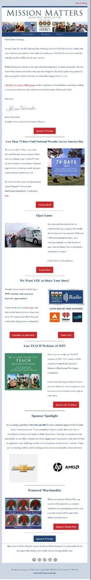
What Works Well
- Warm, heartfelt opening. The introduction, with its reflection on remembrance and Gold Star families, sets a beautiful, reverent tone. It’s human, emotional, and authentic; exactly what you want from a mission-driven nonprofit. It gently pulls readers in and frames the purpose before any “ask” appears.
- Personal touch. The inclusion of Karen Worcester’s signature (image) adds credibility and intimacy. It’s not something you’d do for every email, but for this organization and mission, it works. It signals that this is more than a mass email; it’s a message from a person who truly cares.
- Strong primary CTA early on. “Sponsor Wreaths” is a clear, purpose-driven call to action, and it’s smartly positioned near the top, accompanied by the countdown (“74 days”). The time-sensitive framing adds urgency, which is critical for donation-based campaigns.
- Genuine storytelling tone. Every section feels sincere, not polished for marketing’s sake, but written by people passionate about their cause. That authenticity is an asset worth preserving.
- Variety of engagement opportunities. Between the sponsorship callout, volunteer appeal, interview invitation, and webinar, there’s something for everyone. This diversity of touchpoints gives readers multiple ways to engage, ideal if segmented well.
Opportunities to Improve
- Too much content for one send. This email feels like three or four separate campaigns stitched together. You’ve got:
- A donation appeal (Sponsor Wreaths).
- A recruitment ask (truck drivers).
- A user-generated content (UGC) request (share your story).
- A webinar registration.
- A sponsor thank-you.
- A merchandise promotion.
That’s not just too long, it’s cognitively exhausting. Each of those could be its own dedicated send or at least separated by audience segment (e.g., donors vs. partners vs. volunteers). Right now, it’s one email trying to serve six goals.
- Hierarchy is out of order. The sponsorship content, which should be the core focus, gets diluted by unrelated sections. The “Sponsor Spotlight” and “Featured Merchandise” both tie back to the wreath sponsorship message but are buried near the end. Moving them up, grouped together under a single “How You Can Support” section, would strengthen focus and flow.
- Segmentation issues. The “Open Lanes” section is written for professional truck drivers. Unless the list is heavily composed of that audience, that content doesn’t belong in a general email. It’s highly specific, and for most readers, irrelevant. A would have made this far more effective.
- Unclear UGC CTA. The “We Want YOU to Share Your Story!” section is confusing. Are they asking for wreath-related stories or any community service stories? The phrase “the great work you’re doing in your community” sounds overly broad. Clarifying scope (“Share how your community honors veterans”) would focus engagement and make submissions more usable.
- Webinar section lacks context. The “Last TEACH Webinar of 2025” announcement doesn’t explain what the webinar is about. There’s a guest speaker mentioned, but no topic or takeaway. Readers can’t assess relevance or urgency without that information, and so they’ll skip it.
- Sponsor spotlight is under-leveraged. The sponsor logos (Chevrolet, HP, AMD) are impressive, real brand equity. But the section buries them mid-scroll and offers no CTA or follow-up (“Join our corporate sponsors,” “Learn about partnership opportunities”). This is a missed conversion opportunity for prospective sponsors.
- Social media links at the end. 罢丑别测’谤别 here. Once someone is in your email audience, sending them back to social media is like inviting them to trade a one-on-one conversation for a noisy public space. Keep them in the inbox, where engagement is deeper and more meaningful.
Bottom Line
This email overflows with heart, but also with content. The tone, voice, and visual elements are excellent, but it needs sharper focus and segmentation to be effective.
To optimize it as a sponsorship email, I’d recommend:
- Narrow the focus to one or two key actions (e.g., Sponsor Wreaths + Sponsor Spotlight).
- Move the sponsorship and merchandise sections to the top under one clear thematic header (“Ways to Support”).
- Split the rest into separate, targeted sends (volunteers, stories, webinars).
- Add a clear secondary CTA under the Sponsor Spotlight (“Become a Corporate Partner”).
- Trim social links. Save them for the footer of lighter, community-oriented updates.
Right now, it’s a heartfelt letter buried inside a newsletter avalanche. With clearer hierarchy and segmentation, it could be a powerful, emotionally resonant sponsorship appeal that moves readers from admiration to action.
Free Sponsorship Proposal Template
This sponsorship proposal template will help you get the partnerships you need.
- Project Description
- Cover Letter
- Sponsorship Levels
- And More!
How to Write an Email for Sponsorship
Writing a sponsorship email isn’t all that different from writing any type of email intended to drive action. You’re building a relationship, addressing needs, and guiding your reader toward a “yes.” The difference is that, instead of nurturing toward a purchase or demo, you’re nurturing toward partnership and investment.
Sponsors aren’t buying a product; they’re buying alignment – with your mission, your audience, your brand values, and the visibility you can give them. Your job is to help them see how that alignment serves their business goals.
Let’s break it down.
1. Start with a clear understanding of your sponsorship offer.
Before you write a single word, be crystal clear on and why it matters.
- What’s the feature? (What they get)
Example: Logo placement on event materials, booth space, inclusion in the program, sponsored webinar segment, access to attendee list, etc. - What’s the benefit? (What it does for them)
Example: Raises visibility among key decision-makers, reinforces thought leadership, generates qualified leads, or deepens community engagement. - What’s the advantage? (Why it’s better than alternatives)
Example: Your audience is highly targeted and relevant to their market, your event offers measurable engagement metrics, or your brand has emotional resonance that reflects well on theirs.
You’re not just selling space or exposure. You’re offering access, alignment, and credibility.
2. Focus on the prospect’s goals, not yours.
Just like in any other marketing message, this email isn’t about you. It’s about them. What do they want to achieve: awareness, engagement, brand association, or lead generation?
The more you show that you understand their business objectives, the more relevant your offer becomes.
Example:
Instead of saying: “We’re seeking sponsors to help fund our annual conference.”
Try: “We’d love to explore how your brand can gain visibility and connect with senior marketing leaders at our annual conference.”
Same event, same ask. But one centers your need, the other centers their opportunity.
3. Anticipate and address obstacles.
Every sponsor has internal objections before they sign on. Think about them upfront, and bake the answers into your message.
|
Common Objection |
Underlying Concern |
How to Address It |
|
“It’s too expensive.” |
They don’t yet see the ROI. |
Focus on visibility, audience alignment, and lead quality. If possible, share metrics or past sponsor success stories. |
|
“We’re already sponsoring something else.” |
Competing priorities. |
Emphasize differentiation. What’s unique about your audience or mission that others can’t replicate. |
|
“We’re not sure if this aligns with our goals.” |
Relevance gap. |
Tie your mission or audience directly to their brand values or target demographic. |
|
“I don’t have budget approval yet.” |
Timing. |
Offer options like tiered levels, early-bird pricing, or next-year engagement. Keep the conversation alive. |
Good sponsorship emails preempt hesitation with reassurance, and make the next step feel low-risk.
4. Use key messages that reinforce value.
Every sponsorship email should have one clear core message, your “north star.” Then, support it with 2-to-3 short, proof-driven supporting points.
Example:
Core message: Partnering with [Your Organization] connects your brand to a high-value audience in a trusted, mission-driven environment.
Supporting messages:
- Engage directly with [target audience description — e.g., 2,000+ marketing decision-makers].
- Reinforce your brand’s commitment to [shared value — innovation, education, sustainability, etc.].
- Gain year-round visibility through [specific assets — events, newsletters, podcasts, etc.].
This approach keeps your message consistent across emails, conversations, and follow-ups.
5. Match your tone to the relationship stage.
Your first email shouldn’t sound like a contract negotiation. , sponsorship outreach follows a cadence:
|
Stage |
Tone |
Goal |
|
Awareness |
Warm, introductory, conversational |
Introduce the opportunity and build trust. |
|
Consideration |
More detailed and data-driven |
Provide sponsorship options, metrics, and benefits. |
|
Decision |
Confident, specific, and value-focused |
Close the deal, confirm interest, or schedule a call. |
If you’re emailing a cold prospect, keep it short, personable, and inviting. If it’s a warm lead or returning sponsor, it’s fine to be more direct. They already trust you.
6. End with a clear, easy CTA.
The biggest mistake in sponsorship emails is assuming someone will “get in touch if interested.” Don’t make them guess the next step.
Make your ask explicit, but frictionless.
Examples:
- “Would you like me to send the sponsorship overview?”
- “Are you open to a 15-minute call to explore partnership options?”
- “Learn more about sponsorship tiers here [link].”
A good sponsorship CTA feels like an invitation, not a demand. You’re opening a door, not closing a deal (yet).
7. Keep it short, focused, and skimmable.
You’re writing to decision-makers. They skim. Aim for:
- Intro paragraph – Why you’re reaching out.
- Value paragraph – What’s in it for them.
- CTA paragraph – What to do next.
If you have supporting proof points (audience metrics, logos, or success stories), link to them, don’t stuff them into the email body. Think of the email as the door, not the house.
8. Remember: Sponsorship is about partnership.
At its best, sponsorship is a collaboration, not a transaction. Your email should reflect that spirit. You’re not asking for a favor; you’re offering a way for both parties to amplify their impact.
That mindset shift alone will make your outreach more effective and your tone more authentic.
A Tried-and-Tested Sponsorship Email Template
Here’s a pre-made sponsorship email template you can use to create your first set of emails.
Subject: Become a sponsor for [Event]!
Hey [Sponsor’s Name],
I’ve been following [Sponsor Company] for a few years now, and I recognize your commitment to [specific values or mission]. That’s why I’m reaching out to you with an exciting opportunity to showcase your passion for this cause by becoming a part of [event name].
Here’s why I believe it’s a great opportunity for your brand:
- Benefit #1
- Benefit #2
- Benefit #2
I’d love to give you the exclusive offer of [mention exclusive offer] and a platform to partner with key industry leaders and decision-makers.
Would you be keen to discuss more details about this partnership? Please book time here to learn more about our sponsorship packages.
Best,
[Your signature]
Securing Sponsorships Made Easy With Email Examples
If you’ve made it this far, you already know more about what makes a great sponsorship email than most people sending them. You’ve seen the good, the bad, and the almost-there; you’ve probably recognized a few patterns along the way. The most successful emails don’t rely on slick design or clever gimmicks; they rely on fundamentals. 罢丑别测’谤别 clear, relevant, respectful of the reader’s time, and focused on creating mutual value.
And remember: Every sample here came straight to my inbox. Some made me pause, some made me roll my eyes, and one or two actually earned a reply, which, trust me, is no small feat. If your sponsorship email can win over a marketer who scrutinizes every spend like it’s her own (because it is), you’re already playing in the top tier.
So take what you’ve learned here, use the “How to Write an Email for Sponsorship” section as your guide, and start crafting. Apply the principles, borrow the structure, and make it your own.
You don’t need to be a Fortune 500 brand to write like one. You just need to respect your reader, understand your value, and communicate it with confidence. Do that, and your next sponsorship email won’t just land in someone’s inbox. It’ll get a reply.
Editor's note: This post was originally published in March 2024 and has been updated for comprehensiveness.
Free Sponsorship Proposal Template
This sponsorship proposal template will help you get the partnerships you need.
- Project Description
- Cover Letter
- Sponsorship Levels
- And More!
Email Examples
![12 great examples of welcome emails for new customers [templates]](https://53.fs1.hubspotusercontent-na1.net/hubfs/53/welcome-email-examples-1-20251024-7984960.webp)
.webp)
![4 types of emails that get the most engagement [+ 4 emails that fail]](https://53.fs1.hubspotusercontent-na1.net/hubfs/53/Untitled%20design%20(56).jpg)