.png?width=112&height=112&name=Image%20Hackathon%20%E2%80%93%20Horizontal%20(64).png)
Having a well-designed website isn’t enough. Businesses have to build online experiences that stack up to their competitors. Running a website design competitive analysis allows teams to evaluate competitor websites and uncover opportunities for differentiation. Research methods examine interface design and site functionality. From there, teams can make strategic design decisions.
After running a competitive analysis focused on UX design, web teams better understand the strengths and weaknesses in their user experience approach. UX designers should review between three and five direct competitors. Then, designers can make tweaks to their online presence so the brand can shine.
This post dives deep into running a website design competitive analysis. Looking for extra guidance? provides structured frameworks for documenting findings.
Table of Contents
- What Website Design Competitive Analysis Is
- How to Conduct a Competitor Website Design Competitive Analysis
- Benefits of Website Design Competitive Analysis
- Methods for Competitive UX Analysis
- Running a UX Competitive Analysis: Project Management Tools
- Best Practices and Practical Considerations for Running a Website Design Competitive Analysis
- Common Website Design Competitive Analysis Mistakes to Avoid
What Website Design Competitive Analysis Is
Website design competitive analysis is a UX research methodology that compares a company’s site to its competitors. UX designers compare site performances to industry standards and user expectations. UX teams organize competitor research into actionable insights. The analysis examines:
- Visual design.
- Information architecture.
- Interaction patterns.
- And content strategy across competitor sites.
When to Conduct Competitive Analysis
A competitive analysis is most effective when conducted before a major design initiative begins. Teams should complete this research when a project kicks off. Insights from the analysis can be incorporated in wireframing and early redesign phases.
Beyond that, teams should conduct website design analyses regularly. Consistent monitoring can help teams catch emerging design trends and shifts in competitor strategy. Savvy web experience leaders conduct reviews every six to 12 months.
Types of Competitive Analysis
UX competitive analysis falls into three categories. Teams often combine these approaches for comprehensive insights. Categories include:
- Feature-based analysis, which compares specific functionality across competitor sites.
- Heuristic evaluation, which assesses usability against established principles.
- Behavioral analysis, which examines user task flows and interaction patterns.
Throughout my journey in software development, I've discovered that timing matters enormously. Starting competitive analysis after design work begins means costly revisions.
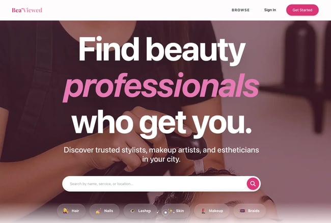
When building , my beauty-tech platform, I wasted three weeks rebuilding the homepage and directory cards because I hadn't researched competitor patterns first. Now, I always complete this analysis before the first wireframe gets created.
How to Conduct a Competitor Website Design Competitive Analysis
A competitive UX analysis follows a structured process that starts with research planning and crafting a framework for evaluating competitors. Then, UX designers dive into the sites to see where competitors pull ahead. The end result is actionable findings. can be used throughout the process.
Step 1: Define your scope.
Before starting an analysis, the web team needs to define the scope. Project leaders should outline specific research objectives, target competitors, and evaluation criteria before research begins. A clear scope keeps teams focused on high-impact areas that drive design decisions.
Research teams should identify two to three specific questions they need answered. For example, designers may ask, “What navigation patterns do competitors use for multi-level product catalogs?” or “How do competitor checkout flows handle guest purchases?” Focused questions yield more actionable insights than broad, exploratory research.
includes a goal-setting worksheet that helps teams articulate specific research questions. From there, teams can define success criteria and align on expected outcomes.
From my experience, vague goals like “understand the competition” waste time. I once spent two weeks analyzing everything about five competitor sites. Then, I realized I had no clear direction for applying the findings. Now, I write three to five specific questions before starting, which keeps the analysis laser-focused.
For , my questions were:
- How do review platforms build trust and verify authentic client experiences with beauty professionals?
- What booking and budgeting features do users expect when planning beauty appointments?
- How do competitor platforms showcase professional portfolios to help clients make confident decisions?
These specific questions made the analysis immediately actionable.
Step 2: Select the right competitors.
Next, web teams should choose three to five direct competitors plus one or two indirect competitors for the analysis. Direct competitors target the same audience with similar offerings. Indirect competitors operate in adjacent markets but solve similar user problems. This balanced approach reveals both industry standards and innovative approaches.
When choosing a competitor, look at:
- Their market position. Aim for sites with a similar audience size and reach.
- Their target audience overlap. Demographics and psychographics should be similar to the brand’s buyers.
- Feature comparability. Offerings should have some overlap in functionality.
I always include at least one indirect competitor from a more innovative industry. For a sport’s brand, I analyzed a direct-sales wellness company‘s distributor onboarding flow. Even though they’re in a different vertical, that cross-industry perspective revealed a progressive disclosure pattern for building professional profiles. We adopted that approach and increased our professional signup completion by 34%.
Pro tip: provides a competitor selection matrix that scores potential candidates across these dimensions.
Step 3: Create your evaluation framework.
With competitors identified, UX designers need to establish what criteria they’re actually comparing. Evaluation frameworks establish consistent categories for comparison. Teams should consider usability principles with product-specific criteria relevant to the project goals.
are one popular way to evaluate sites. Evaluation criteria dive into how easy the platform is to use, design aesthetics, documentation, and how much control a user has over their experience. includes pre-built heuristic evaluation scorecards based on Nielsen's principles.
Step 4: Conduct the analysis through systematic evaluation.
Next, teams should run the analysis. UX designers can systematically evaluate competitors against the framework defined in the last step. Evaluators complete tasks as users would, documenting observations in real-time. Screen recordings with think-aloud narration provide rich qualitative data about user experience issues.
Each competitor evaluation takes 45 to 90 minutes. Try to review all competitors within a one- to two-week timeframe. A smaller window helps maintain consistency and ensures market conditions remain stable.
Pro tip: HubSpot's reveal competitor keyword strategies, content performance, and search visibility alongside UX evaluation. These integrated tools show how design decisions support or hold back content marketing effectiveness.

Step 5: Gather user feedback.
Evaluations only capture so much. User feedback reveals deeper insight into competitor products. Competitor reviews provide authentic user frustrations that rarely surface in formal research. Valuable review sources include:
- App store reviews and .
- and discussions.
- Social media comments and support forums.
Design teams should look for patterns across complaints and praise. Single complaints may reflect individual preferences, but repeated issues signal authentic usability challenges.
Support forums provide particularly valuable insights. Users discuss workarounds or ask “how do I...” questions. Confusion reveals functionality gaps. For example, multiple forum posts asking “How do I export my data from [Competitor]?” signal a missing or hard-to-find feature.
has emerged as a particularly candid platform where users express honest opinions without filtering criticism. For example, a Threads user openly discussing website navigation frustrations — the type of unfiltered feedback that reveals genuine UX pain points competitors face.

Step 6: Document patterns and insights.
Once all competitor analyses are done, UX teams should review their notes and look for patterns. Teams may find industry standards that users expect and ways that they can stand out in a crowded online market. Other common discoveries include frequent mistakes and missed opportunities.
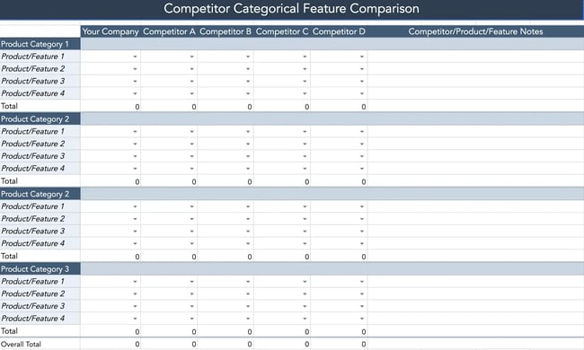
I recommend building a feature comparison matrix. Here, designers can cover which competitors offer what features, how they’re implemented, and user satisfaction. This visual comparison quickly reveals where consensus exists and where approaches diverge.
Pro tip: provides pre-formatted comparison tables and pattern analysis worksheets. These resources help teams move from raw observations to strategic insights.
Standards appearing across four or more competitors show an industry trend. Deviating from these patterns requires strong justification. User testing can validate whether alternative approaches work better.
Step 7: Prioritize actionable findings.
Once an analysis is complete, teams need to prioritize which findings require action and those that need more evaluation. Organize insights into four categories:
- Quick wins, or easy implementations with high impact.
- Required standards, or necessary features that users expect.
- Differentiators, or unique features providing a competitive advantage.
- Future innovations, or experimental features requiring more research.
Quick wins deliver value with minimal investment. For example, the web team may improve the contrast color of a button and see increased conversions. Required standards prevent user frustration, like seamless checkout experiences.
Differentiators and innovative features require careful consideration. They only offer a competitive advantage when they solve genuine user problems better than existing approaches. Innovation for innovation's sake creates learning curves without delivering value.
Step 8: Present findings effectively.
Effective presentations offer actionable recommendations for stakeholders. Be sure to include visual elements during the meeting. Screenshot comparisons that show competitors' side-by-side help make design alternatives concrete. Annotated images can also highlight specific UX issues.
Pro tip: includes a presentation template with pre-built sections. The presentation template can help reduce prep time while ensuring comprehensive coverage.
Step 9: Create an Action Plan
Action plans transform research insights into implementation roadmaps. Effective plans assign ownership for each recommendation with clear, realistic timelines. Success criteria are also clearly defined. Metrics might include task completion rates, time-on-task reductions, error rate decreases, or conversion rate improvements.
Step 10: Establish ongoing monitoring.
Ongoing monitoring tracks competitor evolution and market changes over time. Competitive landscapes shift with new players entering markets, redesigns, and evolving user expectations. Teams should schedule reviews regularly to keep up. For fast-moving markets, aim for quarterly reviews. In slower markets, run reviews annually or every six months.
Pro tip: track competitor product launches, while tools like monitor specific competitor pages for changes. tracks competitor content performance and keyword rankings over time. Teams can then see spikes and when to re-evaluate.
Benefits of Website Design Competitive Analysis
A competitive UX analysis helps teams understand how their website measures up with other brands. Teams can get data-backed insights into where they fall short before spending on site revisions. Making the right changes also leads to higher user satisfaction scores.
See the top benefits of running a website design competitive analysis.
Make Data-Driven Design Decisions
Data-driven design decisions rely on evidence from competitor analysis, user research, and usability testing rather than assumptions. Running a competitive analysis provides market context that validates or challenges internal thinking.
Design debates often devolve into subjective preference battles. Competitive analysis insights replace options with evidence and create more objective design criteria.
Identify Market Gaps and Opportunities
Market gaps represent unmet user needs, where no competitor provides adequate solutions. These gaps create opportunities for differentiation. The intersection of “users need this” and “competitors don't provide it” marks high-value opportunities.
Some gaps exist because they're technically difficult or economically unfeasible. Other gaps persist because no competitor recognized the need. Teams need to identify and qualify gaps to prevent chasing impossible features.
Nail the Basics and Know Where to Innovate
states that users spend most of their time on other sites. Users prefer your site to work the same way most of the internet does. Competitive analysis reveals which patterns users encounter frequently enough to become expectations. Teams need to hit these foundation elements. From there, they can focus on innovation efforts where differentiation matters most.
Design innovation builds on existing patterns rather than reinventing interfaces from scratch. Understanding what already exists frees designers to focus creative energy on genuine differentiators, rather than solving already-solved problems.
Reduce Development Risk
Development risk decreases when teams build on proven patterns. Competitive analysis shows which standards work reliably across websites. Teams can then choose an approach that is intuitive for users and avoid confusion.
Experimentation carries inherent risk. Competitor analysis helps teams identify which aspects of the design are low risk and easy for users to understand. They can then better evaluate custom solutions that require more validation (higher risk).
Pro tip: helps teams distinguish between patterns that require validation and those that can be confidently implemented based on market evidence.
Establish Performance Benchmarks
Performance benchmarks provide comparison points for measuring a site’s UX against competitors. Benchmarks might include task completion rates, time-to-complete critical workflows, error rates, or user satisfaction scores.
Benchmark establishment requires measuring the same tasks across all competitor sites under controlled conditions. For example, timing how long it takes to complete a purchase from the product page to order confirmation.
Competitive benchmarking reveals not just whether a website design works, but how it compares to alternatives users experience. A checkout flow that takes three minutes might seem fast in isolation. However, it’s slow if competitors average 90 seconds.
Methods for Competitive UX Analysis
Competitive UX analysis employs multiple research methods that provide complementary perspectives on user experiences. Review methods evaluate sites against established usability principles. Teams may run analyses without direct user participation or through usability testing with real users.
Expert Review Method
Expert review involves UX professionals evaluating competitor websites against established criteria. Direct user participation is not needed. Expert reviews deliver rapid insights at low cost, making it ideal for initial competitive assessment.
Step 1: Select evaluation criteria.
Determine what aspects of the competitor sites get assessed. Nielsen's 10 usability heuristics provide a research-validated foundation that works well for most digital products. Custom criteria can be added to reflect product-specific considerations.
For example, ecommerce sites might add criteria around product photography quality, size guide clarity, or shipping cost transparency. B2B SaaS products might evaluate trial signup friction or feature discovery patterns.
Step 2: Conduct the heuristic evaluation.
Heuristic evaluation involves at least three to five evaluators independently reviewing each competitor site. They score sites against the evaluation framework and document specific examples of compliance or violation.
Evaluators should complete realistic user tasks rather than passively browsing. For an ecommerce site, that might include finding a specific product, adding it to cart, and proceeding through checkout.
Documentation should include screenshots of issues and severity ratings. Evaluators should consider how much issues hurt the user experience and how often users encounter the problem.
Step 3: Consolidate findings and prioritize insights.
Consolidation involves synthesizing individual evaluator findings into one document. Findings should note consistent patterns, unique approaches, and common issues across competitors. If multiple evaluators identify the same issue independently, the recommendation carries more weight than observations from a single reviewer.
It’s best to use synthesis worksheets where teams can aggregate individual evaluator scores and consolidate observations. includes a worksheet that your team can use right away.
Next, decide which findings are must-fix issues, changes that align with best practices, and differentiating opportunities.
Pro tip: Expert reviews deliver fast results, but I've learned they miss important nuances only real users reveal. In one project I worked on, an expert review confidently recommended a navigation pattern. Meanwhile, actual user testing showed it confused 7 of 10 participants. Now, I always validate insights with at least lightweight user testing.
Competitive Usability Testing
Competitive usability testing recruits representative users to complete tasks across the brand’s and competitors’ sites. The process reveals insights into the user experience through direct observation.
Step 1: Define test scenarios.
Test scenarios specify realistic tasks users will attempt on each competitor site. Scenarios should reflect actual user goals. For example, “Find a blue sweater in size medium under $100” works better than “Locate the product catalog.”
Scenarios should be identical across so they can be compared. If testing checkout flows, all participants should purchase the same item type (even if specific products differ) using the same payment method.
Pro tip: scenario planning worksheets that help teams develop comparable tasks across competitor sites.
Step 2: Recruit participants.
UX teams should look for participants who match the brand’s ideal customer. Look for similar demographics and psychographics to the user base. Testing with the wrong users generates misleading insights.
Teams should aim for five to eight participants per competitor for moderated testing, or 20 to 30 participants for unmoderated testing. research shows five users identify 85% of usability issues in moderated sessions.
Screener surveys ensure participants match target criteria and haven't recently used competitor products. Familiarity creates bias favoring known interfaces.
Step 3: Conduct testing sessions.
Testing sessions should follow consistent protocols across all competitors. Randomize which competitor each participant tests to prevent ordering effects. Having the same user repeat a task multiple times creates bias, as repeating an action improves the experience.
Moderated testing allows facilitators to probe user thinking through follow-up questions. Unmoderated testing scales better for larger sample sizes but sacrifices qualitative depth. Record completion rates, time-on-task, error counts, and satisfaction ratings for each scenario. Qualitative observations about user delight or frustration provide context for results.
Step 4: Analyze comparative performance.
A competitor completing checkout 30 seconds faster might indicate superior UX, or it might reflect simpler product offerings that require less configuration. Analysis must consider contextual factors affecting performance beyond pure usability. Statistical significance testing determines whether observed differences reflect genuine UX quality gaps or random variation.
Analytics-Based Benchmarking
Analytics-based benchmarking uses quantitative performance data to compare competitor website technical performance, content strategy effectiveness, and audience engagement. Evaluators review:
Page load speed through ’s Insights scores.
- Mobile usability.
- Site accessibility.
- SEO performance.
- And engagement metrics like estimated bounce rates and time-on-site.
can help teams evaluate their search performance. Combined with UX analysis, this reveals how design decisions support or hinder content marketing effectiveness.
Running a UX Competitive Analysis: Project Management Tools
When analyzing three project management platforms for a UX research team, systematic evaluation revealed distinct patterns in how each tool approaches task management and team collaboration.
Platform Comparison
|
Feature |
Monday.com |
Asana |
Trello |
Pattern Identified |
|
Navigation placement |
Top horizontal nav |
Left sidebar |
Top horizontal nav |
Split approach (no clear standard) |
|
Primary view |
Table/spreadsheet |
Collapsible list |
Kanban board |
Each targets different workflows |
|
Status visualization |
Color-coded columns |
Status badges |
Column position |
Industry expects visual status |
|
Task grouping |
Collapsible sections |
To-do/Doing/Done sections |
Time-based columns |
All use sectioning (required standard) |
|
Quick task add |
+ Add task inline |
Add task button |
+ Add a card |
All provide quick-add (required standard) |
|
Visual density |
High (many columns) |
Medium (focused list) |
Low (card-based) |
Varies by use case |
|
Bulk actions |
Checkboxes visible |
No visible checkboxes |
No bulk selection |
Opportunity gap for competitors |
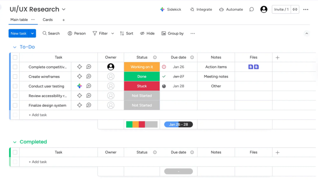
uses a spreadsheet-style interface with high information density and color-coded status columns.
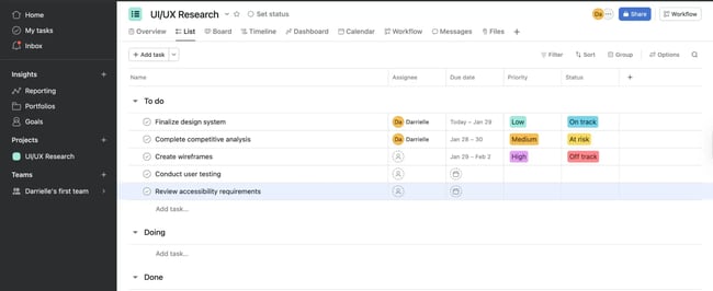
features left-sidebar navigation with a clean list view and status badges.
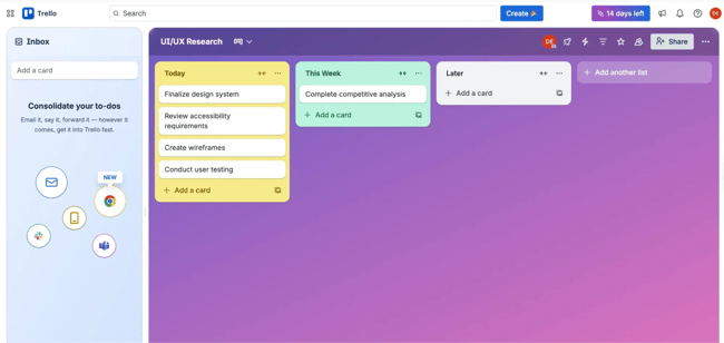
organizes tasks as cards in columns, using spatial position to indicate status.
Key Insights
Industry standards (all 3 platforms):
- Quick task creation functionality
- Visual status indicators (color or position)
- Task grouping/sectioning capabilities
Differentiators:
- Monday.com's bulk editing via checkboxes (competitive advantage)
- Trello's spatial/visual task organization (unique approach)
- Asana's balanced information density (middle ground)
Opportunity gaps:
- None offer AI-powered task prioritization
- Limited keyboard shortcut visibility across all platforms
- No platform shows team capacity/workload at-a-glance
Analysis takeaway: Quick task creation and visual status tracking are non-negotiable features users expect. Monday.com's bulk editing capability provides a competitive advantage that could be adopted. The lack of capacity visualization across all three platforms represents a differentiation opportunity.
Best Practices and Practical Considerations for Running a Website Design Competitive Analysis
When running a website design competitive analysis, teams should make sure to pick out the right number and type of competitors.
Choose the right number of competitors.
The analysis quality depends more on depth than breadth. Analyzing three to five core competitors thoroughly delivers better insights than superficially more sites. More than seven competitors create information overload, which makes pattern identification difficult.
Use essential tools for competitive analysis.
Effective competitive analysis requires its own tool stack. Free tools suffice for most competitive analysis. For example, handles documentation, provides screen recording, and built-in browser screenshot tools capture interfaces. Here are some other helpful solutions, many of which the team may already have access to:
- Screen recording — and .
- Screenshot annotation — .
- Usability testing — and
- Analytics — , , and .
Pro tip: consolidates documentation, evaluation frameworks, and worksheets into a single place. Teams can then stay organized.
Navigate ethical boundaries.
Ethical competitive analysis examines publicly available information without deception or unauthorized access. Browsing competitor websites as any user would, signing up for free trials or accounts, and reading public reviews are all fair game.
Teams should not create fake accounts to access competitor systems, misrepresent themselves to competitor employees, access restricted areas through technical exploits, or violate terms of service. Teams should never try to bypass security controls.
Include your own site in the website design competitive analysis.
Teams with existing products should include their own site in competitive analysis so they can run a self-assessment alongside competitors. Self-evaluation reduces blind spots. Teams intimately familiar with their own product may overlook usability issues obvious to fresh eyes. Evaluating a site with the same criteria applied to competitors provides a balanced perspective.
Comparative analysis reveals whether a product leads, matches, or lags across different dimensions.
includes a section for documenting the brand’s product performance using identical evaluation criteria applied to competitors. The worksheet helps with direct comparison.
Avoid analysis paralysis.
Analysis paralysis occurs when teams spend excessive time researching without progressing to design decisions. Diminishing returns set in when additional research produces negligible new insights.
Timebox competitive analysis to two to three weeks for comprehensive projects and one week for focused reviews. Remember: Perfect information is impossible. Good-enough insights that inform decisions create more value.
Know when additional research is needed.
Competitive analysis provides an external market perspective but doesn't replace other UX research methods. Additional research becomes necessary when findings reveal conflicting approaches across competitors. Teams will also find opportunities that require extra validation or create questions about implementation.
Further, competitive analysis shows what exists but not always why. User research methods like interviews and surveys reveal the motivations that competitive analysis can't capture.
Common Website Design Competitive Analysis Mistakes to Avoid
Running a website design competitive analysis is not without pitfalls. Blindly copying competitor features assumes their design decisions were correct without validation. Competitors make mistakes too. Multiple competitors following the same pattern doesn‘t guarantee it’s the best approach.
Ignoring context is another mistake. A feature working well for an enterprise SaaS product might frustrate small business users with different needs. Competitor resources, technical constraints, and strategic priorities differ from industry to industry. Other common mistakes include:
- Confirmation bias, or cherry-picking findings that support preexisting opinions.
- Insufficient documentation, or relying on memory rather than systematic recording.
- And skipping synthesis, or collecting data without extracting actionable insights.
Use competitor analysis UX research to inspire your site design.
Website design competitive analysis helps UX teams understand competitor experiences. HubSpot's Competitive Analysis template provides pre-built worksheets and evaluation frameworks that can help teams find differentiation opportunities.
Stay curious and look beyond obvious competitors. Teams can innovate by pulling inspiration across industries. And, remember that competitive analysis serves the user. Understanding what users experience elsewhere helps you design experiences that truly meet their needs.
Editor's note: This post was originally published in April 2023 and has been updated for comprehensiveness.
.webp)
10 Free Competitive Analysis Templates
Track and analyze your competitors with these ten free planning templates.
- SWOT Analysis
- Battle Cards
- Feature Comparison
- Strategic Overview
Download Free
All fields are required.
Form not available
You're all set!
Click this link to access this resource at any time.
User Experience

![How to become a UX designer, a step-by-step guide [expert tips]](https://53.fs1.hubspotusercontent-na1.net/hubfs/53/become-a-ux-designer-1-20240731-321437.webp)


![How to Add a Parallax Scrolling Effect to Your Website [Examples]](https://53.fs1.hubspotusercontent-na1.net/hubfs/53/scroll-Aug-11-2023-05-24-08-8793-PM.png)

![20 UX Design Examples Hand-Picked by Experts [With Analysis]](https://53.fs1.hubspotusercontent-na1.net/hubfs/53/ux-design-examples-1-20250404-8425368.webp)