.png?width=112&height=112&name=Image%20Hackathon%20%E2%80%93%20Vertical%20(50).png)

The best recruitment websites serve two audiences at once: candidates seeking a role and employers seeking a hiring partner. That dual purpose drives every design decision, from navigation structure to the call-to-action on the hero. Clear paths, niche-specific messaging, and social proof in the form of logos, testimonials, and placement numbers are what separate the sites that convert from the ones that don’t.
Here are 20 recruitment website design examples worth using as models. For broader inspiration across industries, HubSpot’s shows what standout design looks like beyond recruitment.
Table of Contents

Best Recruitment Websites
- Daversa Partners
- 24 Seven
- Betts Recruiting
- Juicebox
- Hirewell
- Sales Talent Agency
- Aerotek
- Hunt Club
- Rocket
- Mathys + Potestio
- Prometeo Talent
- The HT Group
- Formative Search Partners
- HireBetter
- Robert Half
- Hire Ventures
- Adecco
- Aquent
- Korn Ferry
- The Ford Agency
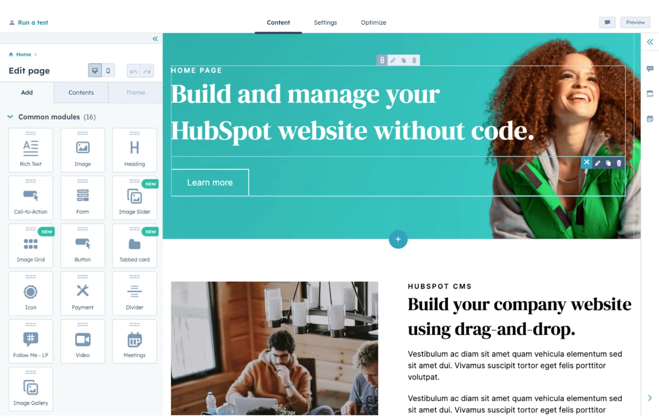
HubSpot's Free Website Builder
Create and customize your own business website with an easy drag-and-drop website builder.
- Build a website without any coding skills.
- Pre-built themes and templates.
- Built-in marketing tools and features.
- And more!
1.
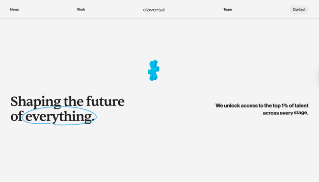
Daversa Partners is an executive search firm that builds leadership teams for venture-backed and growth-stage technology companies. The homepage opens with a single confident line, “Shaping the future of everything,” paired with a rotating phrase that highlights the industries, stages, and functions the firm covers. Below it, a grid of work tiles and a long roster of founders’ names, from Sam Altman to Dylan Field, serve as social proof, while a single “Let’s work together” button keeps the next step clear.
I put the most recognizable proof at the top of the page for this exact reason. Visitors judge credibility within the first few seconds, so the names and logos that carry weight need to land first.
What we like: The rotating hero text adds movement without slowing the page, and it shows the firm’s range at a glance.
Pro tip: Lead with a bold, specific value statement and support it with named clients or founders. Familiar names build trust faster than broad claims about quality.
2.
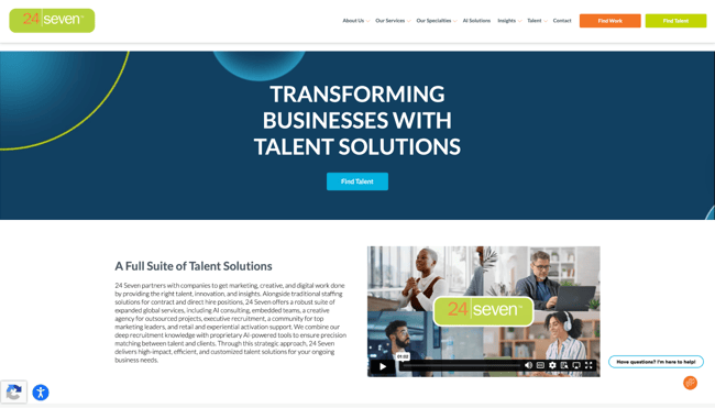
24 Seven is a global recruitment agency for the marketing, creative, digital, and technology sectors. The navigation immediately splits its two audiences, with an orange “Find Work” button for candidates and a green “Find Talent” button for employers. A bold navy hero, the headline “Transforming Businesses with Talent Solutions,” and a focused hero CTA keep the opening clean. Below it, four color-blocked cards separate Staffing, Managed Services, Insights and Events, and the 24 Seven agency network, while a testimonial carousel and a brand video supply social proof and motion.
Splitting audiences right into the navigation is a common pattern in effective recruitment site design. When a candidate and a hiring manager land on the same homepage, each one should spot their own door without thinking.
What we like: The color-coded service cards make four offerings scannable at a glance, and the brand video adds movement without slowing the hero.
Pro tip: Give each audience a clearly labeled call-to-action. Separate “Find Work” and “Find Talent” paths let candidates and employers self-select within the first second.
3.
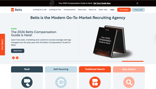
Betts is a go-to-market recruiting agency that builds sales, marketing, and customer success teams for startups. Further down the homepage, a section titled “Helping You Grow from Seed to IPO” pairs an upward-arrow infographic with the funding stages a company moves through, from Seed to Series C and IPO. A short set of benefit bullets beside it covers the size of the talent network, recruiter tenure, and coverage across the startup lifecycle.
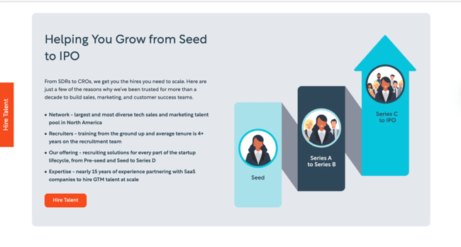
A journey graphic that maps funding stages or growth phases is an effective approach when a firm covers a lot of ground. One clear visual that maps the path gives a prospect the full picture before they read the copy beside it.
What we like: The Seed-to-IPO graphic pairs an upward arrow with real funding stages, and the four benefit bullets beside it keep the section concrete and specific.
Pro tip: Use an infographic to show the breadth of who a firm serves. A journey map works hard below the fold, where a strong visual keeps people scrolling and reading.
4.
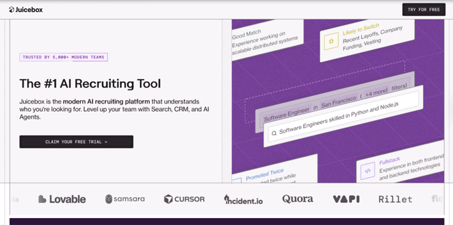
Juicebox is an AI recruiting platform that pairs natural-language candidate search with a CRM and AI sourcing agents. The hero shows the product in action rather than a stock photo: candidate cards tagged “Good Match” and “Likely to Switch” surround a search for “Software Engineers skilled in Python and Node.js.” A “Trusted by 5,000+ modern teams” badge sits above the headline, “The #1 AI Recruiting Tool,” and a logo wall featuring Cursor, Quora, and Samsara runs along the bottom.
Showing the real interface is a choice I respect as a builder. When the product is the selling point, a glimpse of it working in the hero earns trust on its own.
What we like: The hero doubles as a product demo, so a visitor can see how the AI search and match scoring work before clicking anything.
Pro tip: When the product or service is visual, put it in the hero. A real interface or sample output helps prospects understand the offer at a glance and builds confidence before the first click.
5.
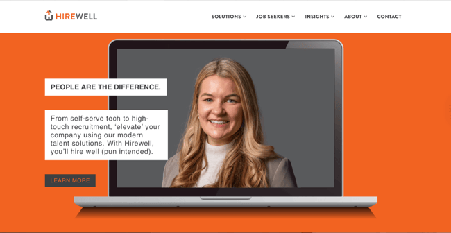
Hirewell is a recruiting firm that spans technology, go-to-market, corporate, and industrial roles across industries like SaaS, healthcare, and financial services. The homepage hero runs on a bold orange field, with a recruiter’s photo framed within a laptop mockup and offset white text blocks reading “People Are the Difference.” The subhead leans into the brand’s wordplay, promising companies will “hire well” with Hirewell.
The contact page carries the same friendly tone. A “Drop Us a Line” form sits beside direct email, phone, and office details, and a short line, “We look forward to hearing from you,” makes the outreach feel personal. Visitors can fill out the form or reach a specific brand and office directly.
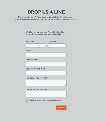
What we like: The warm microcopy turns a routine contact form into an invitation, and the orange palette stays consistent from the hero all the way down.
Pro tip: Give a contact form a human voice and a backup path. Friendly microcopy plus a visible email, phone number, and office address lets every visitor reach out in the way they prefer.
6.
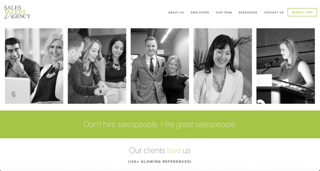
Sales Talent Agency is a recruiting firm built entirely around sales roles. The homepage hero stacks five black-and-white photos of real salespeople into a filmstrip, then drops a bold green band carrying one line: “Don’t hire salespeople. Hire great salespeople.” A claim of 150+ glowing client references sits directly beneath it.
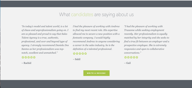
Further down, a “What candidates are saying about us” section presents testimonials with five-star ratings and first names, paired with a “Write a Review” button. Star-rated reviews from named people, alongside the client references up top, turn the agency’s claims into proof a visitor can check.
Reviews sit at the center of everything I build. I founded , a platform where verified reviews and claim profiles drive the whole experience, so I have seen firsthand how much weight a single credible review carries. That conviction follows me into client work. On any business website I build, I push for real reviews on the homepage, since a named, star-rated endorsement earns trust the moment a visitor lands.
What we like: The named testimonials with star ratings read as genuine, and inviting visitors to “Write a Review” signals the agency stands behind its reputation.
Pro tip: Put real reviews on the homepage. Named testimonials with star ratings build trust, and a visible count, such as “150+ references,” reinforces that trust.
7.
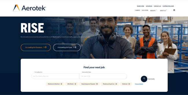
Aerotek is a large staffing agency specializing in industrial and skilled trades roles, from maintenance mechanics and welders to warehouse supervisors and electricians. The hero pairs a one-word headline, “RISE,” with a full-bleed photo of a diverse crew on a plant floor and two clear paths: “I’m Looking For Solutions” for employers and “I’m Looking For A Job” for candidates. A white search card sits right inside the hero, with fields for role and location, plus quick tags for common trades.
Putting the job search in the hero is a move I respect. A candidate who arrives ready to look can type a title and a zip code without hunting for a careers link, and that head start turns browsers into applicants.
What we like: The in-hero search bar lets candidates start looking in one step, and the quick tags for roles like MIG Welder and Electrician signal the agency’s trade focus right away.
Pro tip: Put a job search bar in the hero. Letting candidates search by role and location on arrival shortens the path from landing to applying and connects people to jobs faster.
8.
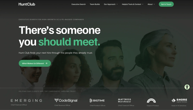
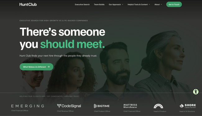
Hunt Club is an executive search firm for high-growth, VC- and PE-backed companies. The hero leads with a trust message, “There’s someone you should meet,” over a row of executive profiles, and the subhead explains that Hunt Club sources hires through the people they already trust. A logo wall below pairs each client, from CodeSignal to Hungryroot, with the exact executive role placed, such as Chief Revenue Officer or Head of Product.
Lower on the page, a dark card raises a forward-looking idea: “Your search partner is the most important hire you’ll make,” followed by two buttons, “Ask ChatGPT” and “Ask Claude.” Each one hands the visitor a prepared prompt to ask an AI assistant whether Hunt Club is the right fit.
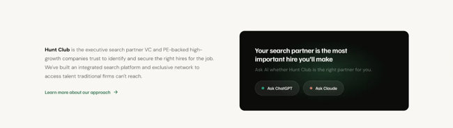
This is the first time I have seen a recruitment site build AI assistants into its calls-to-action, and as someone who designs for how people actually research now, I think it is smart. Buyers are already open to using ChatGPT or Claude to vet vendors, so meeting them at that moment is a forward bet.
What we like: The “Ask ChatGPT” and “Ask Claude” buttons meet buyers where they already research, and the role-tagged client logos prove outcomes at a glance.
Pro tip: Design for AI-assisted buyers. Offering a ready-made prompt to an AI assistant, or simply writing pages that answer buyer questions directly, positions a recruitment website for how people research today.
9.
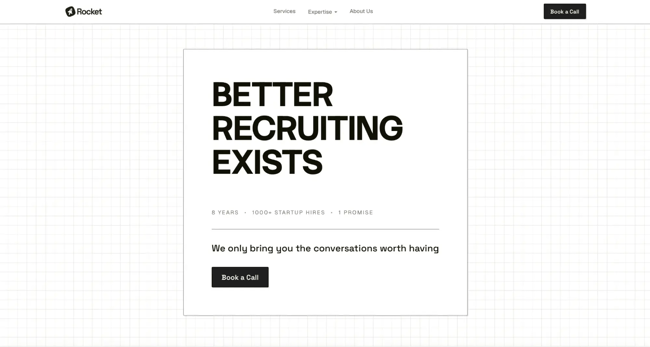
Rocket is a recruiting firm for high-growth tech startups, placing engineering, product, go-to-market, and leadership roles from Series A to IPO. Midway down the homepage, a section headed “Here’s our promise” lays out eight numbered commitments, each a short, declarative principle. The list reads like a set of operating commandments: bring only conversations worth having, take the long view, push back, own mistakes, treat the client’s brand as its own, and keep going until the right person is found.
A numbered promise list is an effective format. Specific commitments a visitor can hold the company to, numbered and scannable, signal confidence and give a prospect concrete reasons to trust the team.
What we like: The eight numbered promises commit to specifics like pushing back and owning mistakes, which reads as honest and gives the brand a clear voice.
Pro tip: Turn brand values into a numbered promise. Short, specific commitments are easy to scan and hold a company accountable, which builds real trust.
HubSpot's Free Website Builder
Create and customize your own business website with an easy drag-and-drop website builder.
- Build a website without any coding skills.
- Pre-built themes and templates.
- Built-in marketing tools and features.
- And more!
10.
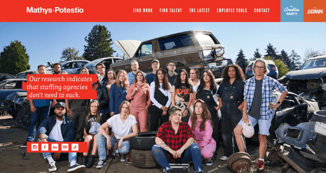
Mathys+Potestio is a staffing agency for creative talent, summed up in its own words as “a staffing agency for creatives by creatives.” The hero stacks a dense, full-width band of cropped photos of many different people above a red text block that introduces the agency and its two tracks: The Creative Party for creative roles and The Administration for operations, finance, and behind-the-scenes work. Each track carries its own “Find Work” and “Find Talent” paths.
The hero looks busy at first glance, and that is the point. The wall of different faces and styles says, before a single word is read, that Mathys+Potestio represents creatives of every shape, size, and discipline. Looking at it as a builder, I read that crowded band as a deliberate signal of range.
What we like: The packed hero imagery doubles as a statement of diversity, and the playful copy (“Visionaries, idea-ists, and workhorses”) matches the creative audience it speaks to.
Pro tip: Let hero imagery carry meaning. A dense collage of varied people can communicate the breadth of talent an agency represents, as long as the layout and color keep it organized.
11.
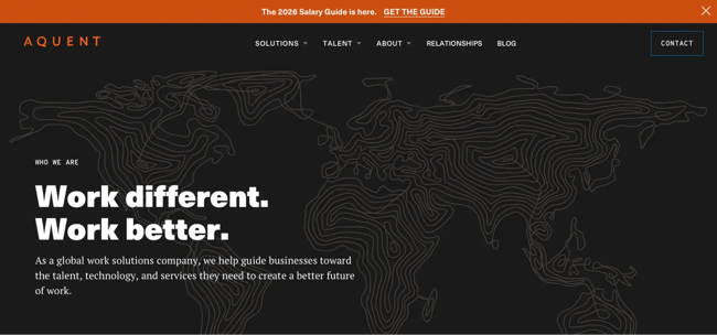
Aquent is a global work solutions company that connects businesses with talent, technology, and services. The hero stays minimal: a faint line-art world map, the eyebrow “Who We Are,” and a broad headline, “Work different. Work better.” A slim banner pinned above the navigation does the heavy lifting, offering the 2026 Salary Guide with a “Get the Guide” link.
Pairing a broad hero headline with a concrete, immediate resource keeps visitors engaged. A resource like a salary guide gives anyone weighing a hire a practical reason to stay on the page, before they’ve read a single line of copy below the fold.
What we like: The 2026 Salary Guide banner gives visitors a practical, immediate takeaway, and the line-art world map signals Aquent’s global reach without a literal photo.
Pro tip: When a hero stays high-level, pair it with immediate value. A free resource like a salary guide or report gives visitors a concrete reason to engage while the headline keeps things broad.
12.
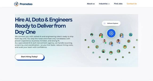
Prometeo is a specialized AI and tech recruitment agency that places AI, data, and engineering talent. The hero headline states the promise directly, “Hire AI, Data & Engineers Ready to Deliver from Day One,” with a “Start Hiring Today!” button below. To its right, an animated graphic visualizes the core service: a central role node labeled “Software Engineer” links by dashed lines to a constellation of candidate avatars, many marked with green checkmarks for vetted matches.
Showing the matching process as a graphic is a smart way to make an abstract service tangible. A prospect quickly grasps “we connect roles to vetted candidates” when the role sits at the center, and the verified matches radiate out from it.
What we like: The candidate-matching constellation turns the agency’s process into a single, scannable image, and the green checkmarks read instantly as vetted, qualified talent.
Pro tip: Visualize the process, not just the people. An illustrative graphic that shows how an agency connects roles with vetted candidates explains the value at a glance.
13.
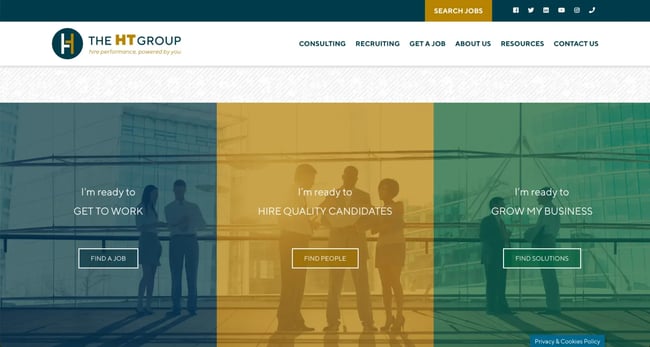
The HT Group splits its homepage into three color-coded panels, each aimed at a different visitor: one to find a job, one to hire quality candidates, and one to grow a business through consulting. The layout routes each audience member to the next step at a glance. Cohesive branding runs throughout, with the same professional palette and fonts carried from the headers down to the icons.
A three-way split is an effective pattern for agencies serving more than two audiences. Job seekers, hiring managers, and business owners each see their own door immediately, which makes the first click obvious.
What we like: The HT Group publishes free resources and a blog. Content like this introduces potential clients to the brand and keeps the agency top of mind for future hiring needs.
Pro tip: Watch load speed on image-heavy heroes. This three-panel design looks great, but the page loads slowly, which can cost visitors before they ever see it. Optimize hero images, lazy-load media below the fold, and test performance so a strong layout reaches the people it was built for. HubSpot’s is a useful reference for seeing how high-performing sites handle image-heavy layouts.
14.
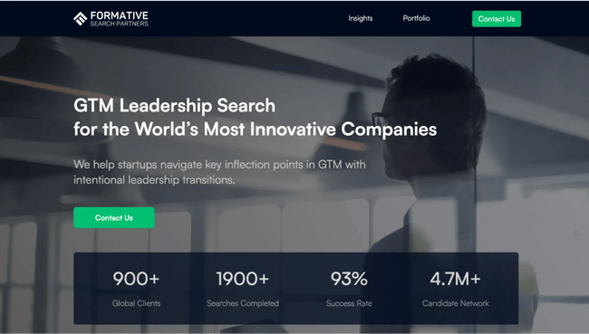
Formative Search Partners is a go-to-market leadership search firm for high-growth startups, and it is the rebrand of the agency formerly known as CloserIQ. The homepage states that focus is right in the headline, “GTM Leadership Search for the World’s Most Innovative Companies,” set over a dark, photo-led hero. A single green “Contact Us” button repeats in the navigation and again in the hero, so the next step stays obvious.
A stats bar anchors the page with four figures: 900+ global clients, 1,900+ completed searches, a 93% success rate, and a 4.7M+ candidate network. Numbers like these turn a credibility claim into evidence that a visitor can weigh in seconds.
When a client asks me how to prove results on a homepage, I point to formats like this. A specific number convinces faster than any adjective.
What we like: The green CTA reads cleanly against the dark navy palette, which keeps the primary action visible without crowding the page.
Pro tip: Put hard metrics above the fold. Placement rate, searches completed, and network size give visitors verifiable proof of capability before they scroll.
15.
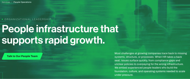
512Financial is an Austin-based firm that places experienced HR and finance leaders inside growing companies on a fractional basis. The People Operations page opens with a direct problem statement and breaks its services into six clear areas, from HR leadership and payroll to HRIS implementation and compensation benchmarking. A People Readiness Assessment lets visitors check where their HR infrastructure stands before reaching out.
What we like: The People Readiness Assessment gives visitors something concrete to interact with, and the sample output showing compliance, payroll, and HRIS status makes an abstract service immediately tangible.
Pro tip: Offer a diagnostic before a demo. A self-assessment tool that surfaces a visitor’s specific gaps does more conversion work than a general capabilities page because it makes the need feel real before the sales conversation begins.
16.
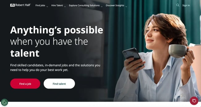
Robert Half is the world’s largest specialized staffing firm, covering finance, technology, marketing, legal, and administrative roles. A “Why Robert Half” band leads with three proof points: number one on Forbes’ list of America’s best professional recruiting firms for seven straight years, two million-plus placements, and 300-plus locations. The site organizes its catalog into field sections with specific linked role pages, and a companion mobile app extends the same search to phones with one-tap apply.
Plenty of my tech coworkers have landed short-term contracts through Robert Half, and they keep coming back because the search is so easy. They scan open roles on the site or open the Robert Half app and apply with a tap, whether they want a contract gig or a permanent move.
What we like: The specialization sections turn an enormous service menu into something scannable, and the matching mobile app carries that same easy role discovery to a phone.
Pro tip: Make a broad catalog easy to search on every device. Named, specific role pages help both visitors and answer engines find the right fit, and a companion app extends that search to mobile.
17.
Hire Ventures is an HR and recruiting firm that helps companies build and keep teams for sustainable growth, captured in its hero line, “The Finders and Keepers of Talent.” The homepage pairs that headline with a friendly flat illustration of people searching and connecting. A chatbot opens upon arrival and greets visitors with guided quick replies: HR or Recruiting Support, Job Opportunities, or a General Question.
What we like: The chatbot sorts every visitor into the right conversation in one tap, and the playful illustration keeps the HR-and-recruiting message approachable.
Pro tip: Use a greeting bot with guided replies. A short prompt offering a few clear options, like support, jobs, or general questions, routes visitors instantly, and captures interest before they navigate away.
18.
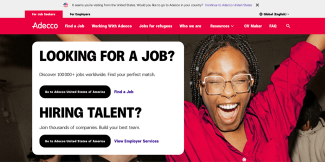
Adecco, one of the largest U.S. staffing firms, places temporary, temp-to-hire, and permanent talent across industries. Two tabs at the top, “For Job Seekers” and “For Employers,” swap the entire experience: candidates get a “Need a new job?” search bar, employers get a “Support you can count on” solutions page, and even the chat assistant changes its role to match.
What we like: The persistent For Job Seekers and For Employers tabs hand each audience a tailored site, down to a chat assistant that changes its role to match.
Pro tip: For two distinct audiences, consider tabs that swap the whole experience: navigation, headlines, and tools tailored to each visitor get people to the right content faster.
19.
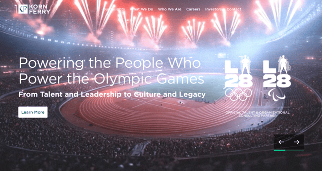
Korn Ferry is the world’s leading executive search firm and a global organizational consulting business, serving 96% of Fortune’s top 50 Most Admired Companies. Its homepage doubles as a thought-leadership hub: the nav opens with “Our Insights,” and the page surfaces a rotating “This Week in Leadership” feed alongside research, such as its Global Talent Analytics Survey. A current video hero spotlights its role as talent partner for the LA28 Olympic Games.
The volume of fresh, credible content is what sets this site apart. When recruitment sites publish a steady stream of research and leadership articles, it signals authority to visitors and gives search engines and AI assistants a deep, current library to pull from.
What we like: The insights hub, from the Korn Ferry Institute to a weekly leadership feed, keeps the site fresh and authoritative, and credibility stats like working with 96% of Fortune’s top 50 Most Admired Companies back it up.
Pro tip: Treat your site as a publishing engine. Regular, well-researched content builds expertise and trust with visitors and provides search engines with a steady supply of up-to-date content to cite. show how leading brands across industries approach content-led site design.
20.
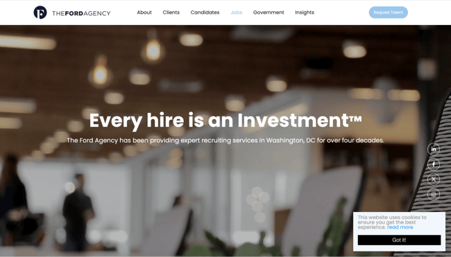
The Ford Agency is a boutique, woman-owned recruiting firm that has staffed Washington, DC, for more than four decades, under the trademarked tagline “Every hire is an Investment.” Its homepage leads with an Industries grid naming the sectors that define the DC market: associations, legal, non-profits, think tanks, public policy, and international development. The live job feed lists each role with its location, type, and a posted salary range.
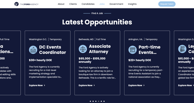
Naming the exact niches a firm serves tells the right clients and candidates they are in the right place, and posting salary ranges up front builds trust before anyone fills out a form.
What we like: The Industries grid signals deep local and sector focus at a glance, and posting salary ranges on every listing is a transparency move that respects candidates’ time.
Pro tip: Own your niche out loud. Naming the specific industries and the local market you serve helps the right clients and candidates self-select, and pay ranges on listings build trust early.
Frequently Asked Questions About Recruitment Website Design
What should a recruitment website include?
A recruitment website needs a clear value statement, separate paths for candidates and employers, and a searchable list of current roles. Job seekers arrive to find and apply, and hiring managers arrive to weigh credibility and reach a recruiter. Proof of results matters just as much — logos, testimonials, placement numbers, and a named team tell visitors what the firm delivers.
How do you design a recruitment website for both candidates and employers?
Split the experience early, right at the top of the page. Some firms use two buttons, like “Find Work” and “Find Talent.” Adecco takes it further with tabs that reload the whole site for each audience, down to the chatbot’s role. The test is simple: can a visitor reach content written for them in one click? Candidates want a search bar, salary ranges, and a quick application. Employers want service details, case studies, and a clear path to request talent. A greeting bot with guided replies, like the one on Hire Ventures, can sort either group the second they land.
What makes a recruitment website stand out?
It comes down to one distinctive feature plus a message that names exactly who the firm serves. The best sites pick a single, memorable element and commit to it: an AI candidate-match demo, salary ranges on every listing, a niche-industry grid, or a weekly insights feed. Specialization seals it. When The Ford Agency lists DC associations and policy groups by name, the right clients know at once they belong there.
Do recruitment agencies need a custom website or can they use a template?
Either works. The deciding factors are budget, in-house technical skill, and how unique the brand needs to feel. Templates get new and boutique agencies online fast with a clean, mobile-ready site. Custom builds make sense when a firm needs features beyond a template’s range, such as deep job-board integrations or a fully separate experience for each audience. For broader design inspiration across industries, HubSpot’s is a useful starting point before committing to a direction.
Building an Attention-grabbing Recruiting Website
The twenty sites here solve the same puzzle in different ways. A global firm like Adecco reshapes its entire layout based on who is visiting. A boutique like The Ford Agency wins by naming its corner of the market. What they share is a clear message and one feature that does real work for the people who land on the page.
There is a newer audience to design for now. AI assistants read recruitment sites and answer questions about them. Clean structure, specific role pages, and fresh, credible content help AI assistants understand a recruitment site and surface it in their answers. The firms that build for human visitors and answer engines alike will show up in more places.
Editor's note: This post was originally published in May 2023 and has been updated for comprehensiveness.
HubSpot's Free Website Builder
Create and customize your own business website with an easy drag-and-drop website builder.
- Build a website without any coding skills.
- Pre-built themes and templates.
- Built-in marketing tools and features.
- And more!
Website Design Examples


![15 black and white website designs to inspire your own [+ pro tips]](https://53.fs1.hubspotusercontent-na1.net/hubfs/53/black-and-white-website-design-1-20250520-1336267.webp)

![Gradient Website Design Examples That Prove This Trend Is Far From Over [+Tutorials]](https://lh7-us.googleusercontent.com/htOWIbyCIoCMxSjC4gJunkGnhCzXpccjTrL8NwoGdRdCsSiEmEAxe_qBFkMrzy2Y8d3cwEr_DMzSGHq9Xi-hQFnMJCo8HDQJ1yQGigcSfFxI2QKXo0s7xXSB2sY-eALG1iUqnHXgomcDsnp7AHRSH1s)
![15 Brochure Website Examples to Inspire You [+ How to Make One]](https://53.fs1.hubspotusercontent-na1.net/hubfs/53/brochure-website-examples-1-20250319-362228.webp)
![28 Types of Websites to Inspire You [+ Real-Life Examples]](https://53.fs1.hubspotusercontent-na1.net/hubfs/53/types-of-websites.png)