.png?width=112&height=112&name=Image%20Hackathon%20%E2%80%93%20Square%20(14).png)
Sales performance dashboards turn raw sales data into actionable insights that help teams track progress towards goals in real time. That definition sounds simple now, but it wasn’t always obvious to me.
The first time a client asked me to create a custom sales performance dashboard, I was 23, a few years into freelancing, and I said yes because that’s what you do when you’re learning on the job. But behind the scenes, I was furiously Googling things like “what does a sales dashboard look like?” and “how do I pick the right KPIs?”
Fast forward to today, and I’ve written a lot of content for SaaS brands helping sales teams track performance more clearly. This piece pulls together the best visual examples I’ve come across across different roles, use cases, and tools. Whether you’re a founder, a sales leader, or just trying to make sense of your pipeline and sales opportunities, this guide will help identify what’s possible.
Table of Contents
- What is a sales performance dashboard?
- How to create a sales dashboard
- 13 sales dashboard examples
- What makes a great sales dashboard?
- Frequently asked questions about sales performance dashboards
What is a sales performance dashboard?
A sales performance dashboard is a visual tool that tracks and displays your team’s key sales metrics in real time. Think sales revenue, pipeline health, win rates, and activity levels. These dashboards transform raw numbers into actionable insights teams can use.
The best sales performance dashboards do more than show pretty charts. They give users real-time visibility into what their team’s doing, how healthy their pipeline is, and their progress towards revenue goals.
Track one rep’s numbers or pull back for a company-wide view. Either way, teams get what they need to make data-driven decisions.
.png)
Free Sales Metrics Calculator
A free, interactive template to calculate your sales KPIs.
- Average Deal Size
- Customer Acquisition Cost (CAC)
- Customer Lifetime Value (CLV)
- And more!
Download Free
All fields are required.
Form not available
You're all set!
Click this link to access this resource at any time.
Types of Sales Dashboards by Role
Not all dashboards serve the same purpose. Sales dashboards fall into three categories based on user role: sales rep dashboards for individual tracking, sales manager dashboards for team oversight, and executive dashboards for strategic initiative and revenue visibility. Each type serves different objectives and answers different questions about performance.
Here’s how different roles use specialized dashboards:
Sales rep dashboards focus on individual performance metrics like calls made, deals in progress, and personal quota attainment. They help sales representatives prioritize their day and identify which sales opportunities need immediate attention.
Sales manager dashboards provide team-wide visibility, showing performance comparisons, coaching opportunities, and pipeline distribution. These dashboards help managers spot trends and intervene before minor issues become big problems.
The best manager dashboards include today’s stats alongside monthly progress toward team targets and MRR goals. It’s the perfect balance of immediate and long-term visibility.
Executive dashboards offer high-level views of revenue forecasts, market performance, and strategic KPIs. C-level executives need comprehensive views without getting lost in operational details, and executive dashboards deliver them.
Essential KPIs to Track on Your Sales Dashboard
Key performance indicators (KPIs) should be selected based on team goals and sales process, not just what looks impressive.
Based on my experience, here are the five key performance indicators every sales team should monitor:
- Pipeline velocity, or how quickly deals move through sales stages
- Conversion rates, or the percentage of leads that become customers at each stage
- Average deal size, or the typical contract value and how it’s trending
- Sales cycle length, or time from first contact to closed deal
- Activity metrics, or calls, emails, and meetings that correlate with success
The magic happens when these metrics are combined. For instance, if your conversion rate drops but activity increases, you might have a quality problem rather than a quantity problem.
Pro tip: If you’re not sure where to begin, check out our guide to sales metrics to determine which pieces of information matter most to you and your sales organization.
Why your team needs a sales dashboard
I resisted dashboards for way too long. I wanted to keep everything in my head or rely on my CRM’s basic reports. But after missing a $15k deal because I lost track of follow-ups, I realized I needed something that would surface the important stuff without me having to go hunting for it.
The biggest benefit I’ve found is speed. Instead of spending 20 minutes every Monday morning pulling together numbers from different places, I can glance at my dashboard and immediately see where things stand:
- Are deals moving through the pipeline as expected?
- Which prospects haven’t been contacted lately?
- What’s revenue looking like for the month?
Effective sales dashboards help sales leaders identify trends, bottlenecks, and opportunities before they become problems. When the conversion rate drops while activity increases, there might be a quality issue rather than a quantity issue. That’s the kind of insight teams get instantly with a good dashboard.
But here’s what sold me. Dashboards keep everyone working from the same information. When I’m collaborating with my virtual assistant, we’re looking at the same numbers, updated in real time. No more “wait, which version of the spreadsheet are we using?” conversations.
As business management expert once said, “You can’t manage what you can't measure.”
The setup does take some work up front. I won’t sugarcoat that. But once teams have a dashboard that fits how they work, it becomes one of those tools organizations wonder how they ever lived without.
How to Create a Sales Dashboard
Creating a sales performance dashboard involves six steps: identifying where sales data lives, determining metrics to track, designing for specific users, selecting the right tools, connecting data automatically, and creating meaningful reports. While the initial setup process may seem intimidating, these steps make it manageable.
1. Choose your data sources
The first step is figuring out where the sales data lives. For most teams, that’s a CRM like HubSpot.
Teams still managing prospects in spreadsheets (I’ve seen this more often than you’d expect), will need to either migrate to a CRM or use a dashboard tool that imports from Excel or Google Sheets.
provides built-in sales performance dashboards and customizable templates, which makes this step straightforward for those already in that ecosystem.

Other excellent data sources are:
- Communication tools that track email opens, call logs, and meeting schedules. Integrating data from these tools reveals sales activity patterns that predict success. For example, users might discover that reps who send follow-up emails within 24 hours close deals 30% faster. Without pulling in communication data, teams would miss these insights entirely.
- Financial systems that provide revenue data, commission calculations, and profitability metrics. Don’t forget to include these for a complete picture. The CRM might show a deal as closed, but a business’s financial system shows when the payment actually arrived and what the margins look like.
Some teams also pull data from Google Analytics to understand how website traffic converts into sales opportunities, or use Power BI dashboards to combine sales data with other business intelligence.
The key is making sure all these sources talk to each other. The best dashboards I’ve seen pull data automatically from multiple systems, giving a unified view without manual data entry.
2. Select the right KPIs
I’ve made the mistake of trying to track everything because it all seems important. The result was a dashboard so cluttered that nobody used it.
Start with the metrics the team already looks at regularly. For me as a freelancer, that meant tracking things like proposal-to-close rate, average project value, and how long deals stayed in each stage of my pipeline. For the B2B SaaS teams I work with, it’s usually monthly recurring revenue, customer acquisition cost, and churn rate.
To get started, ask these questions:
- What metrics does the team regularly review with the entire company, in one-on-one meetings, and with executives?
- Are some metrics more important than others?
- What are the Key Performance Indicators (KPIs)?
- Are there multiple sales teams within my organization?
Here are the categories most teams focus on:
- Pipeline health (conversion rates, deal velocity, stage progression)
- Revenue tracking (closed deals, forecasted revenue, quota attainment)
- Activity metrics (calls made, emails sent, meetings booked)
- Team performance (individual rep performance, win rates by rep)
Teams don’t have to track all the KPIs at once. Start small by picking five to seven metrics max for the first dashboard. More can always be added later.
3. Design for your audience
This is where I see teams go wrong most often. They build a dashboard without considering who will use it and how.
I learned this the hard way with my own freelance business. When I finally moved beyond spreadsheets, I got excited and created this comprehensive dashboard that tracked everything. Deal stages, monthly revenue, project timelines, client communication frequency, you name it.
The problem? When I was heads-down writing, I just wanted to quickly see which prospects needed follow-ups. When I was doing monthly planning, I only cared about revenue forecasts. I’d spend five minutes hunting for the one number I needed.
Here’s what I think about now:
- Who’s the primary user? A sales rep needs different information than a VP of Sales.
- How often will they check it? Daily users need different layouts than weekly reviewers.
- Where will they view it? Desktop? Mobile? In meetings with clients?
I usually recommend building role-specific dashboards:
- Sales reps get individual performance metrics and pipeline health
- Managers get team performance and coaching insights
- Executives get revenue forecasts and high-level trends
4. Pick a sales dashboard provider
CRMs likely include that the team can use. However, if not using a CRM, teams can also use several standalone reporting tools to sync or import their data, enabling them to create their own dashboards and reports.
Here are some of my favorite sales dashboard software providers.
Those already in the HubSpot ecosystem will find solid dashboard features. Teams can pull data directly from HubSpot CRM and connect other tools, too. The biggest advantage is having everything in one place since it can sync data from a wide range of .
What we like: HubSpot gathers all data in one place, creating a single source of truth for the team. The platform also includes Sales Hub for tracking deals and Breeze AI features that automate data entry and surface insights.
Best for: Teams already using HubSpot CRM or those looking for an all-in-one solution.
If you prefer working in spreadsheets before committing to a full dashboard tool, explore our collection of free Excel templates to get started with basic tracking.
This one’s great for teams that want something visual without getting too technical. It connects to 90+ data sources, including HubSpot Sales, Salesforce, and Pipedrive, and has a drag-and-drop interface that makes building dashboards pretty straightforward.
I love how it can be used to create dashboards that teams can share via link or push to Slack channels.
What we like: Geckoboard’s drag-and-drop interface makes it ridiculously simple to create real-time KPI dashboards. The sharing options let users share a dashboard via a link or set up automated notifications and reports on Slack.
Best for: Non-technical teams who want beautiful, shareable dashboards fast.
RIB BI+ is a complete business intelligence platform that can handle sales dashboards along with other functions. It’s suitable for teams that want to visualize data from multiple sources in real time. The sharing options are robust, including automated email reports and embedded analytics.
What we like: RIB BI+ offers multiple sharing options, including automated email dashboards and embedded analytics to boost sales team collaboration and communication.
Best for: Larger teams needing enterprise-level BI capabilities beyond just sales.
Klipfolio lets you combine data from your CRM with other services to create detailed sales dashboards.
What we like: Klipfolio also generates a sales team leaderboard, allowing teams to celebrate top performers and foster healthy competition.
Best for: Teams that want to gamify performance with built-in leaderboards.
Zoho offers a bunch of pre-built reports and dashboards, which can save time if teams don’t want to start from scratch.
What we like: Zoho Analytics fully integrates with HubSpot, enabling users to merge their HubSpot CRM data with 100+ data sources to create meaningful business reports.
Best for: Teams using Zoho’s suite of products or needing quick-start templates.
Coefficient works within Google Sheets, which many teams are already comfortable with. Users can build dashboards that pull live data from their CRM and other tools without the usual copy-paste headaches.
What we like: Coefficient’s templates are unique in that users can power them with live data. There’s no need to copy/paste or import/export. Just make a copy of the template and follow the prompts to sync live data from your tech stack (including HubSpot).
Best for: Teams that live in Google Sheets and want familiar interfaces.
Toucan Toco is a no-code platform that’s designed to be user-friendly for non-technical teams. It handles multiple data sources and focuses on making dashboards that look good and are easy to navigate.
What we like: The sharing and collaboration features are well thought out, with automated reports and embedded analytics.
Best for: Non-technical teams prioritizing ease of use and visual design.
This tool takes a template-based approach, similar to Coefficient. Teams can pick from pre-built dashboards that match their data sources and customize from there.
What we like: Slemma’s templates save time and set you up for success.
Best for: Teams wanting quick deployment with pre-built structures.
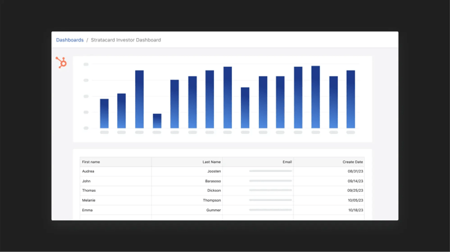
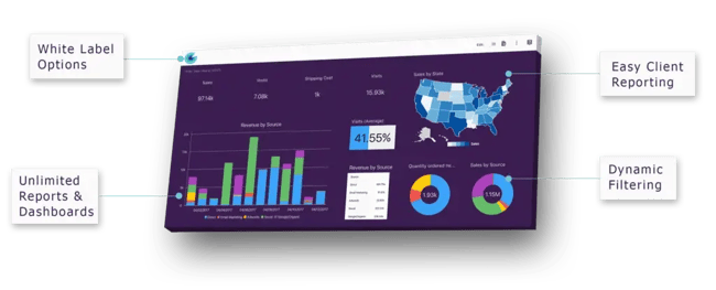
Whenever I’ve been looking to create a dashboard to increase investor visibility, this has been my go-to software solution. With Visible, I can automate report creation, build dashboards, and drill down into report details.
What we like: It’s designed for external stakeholder communication, not just internal tracking.
Best for: Startups and scale-ups reporting to investors and board members.
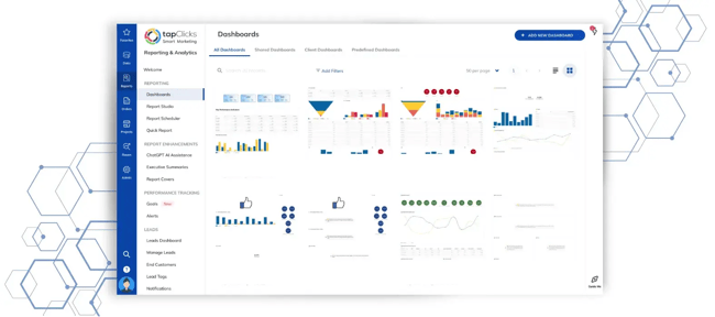
TapClicks focuses on identifying problems before they become bigger issues. The platform sends alerts when metrics reach predefined thresholds, enabling teams to respond quickly.
What we like: Proactive notifications and easy conversion of dashboard data into presentation materials.
Best for: Teams needing automated alerts and executive-ready reporting.
5. Connect to live data sources
Once a tool is selected, teams need to connect their data. If the dashboard integrates with the CRM, this part is straightforward, as most modern tools sync automatically.
For example, if using HubSpot CRM to create dashboards and reports, users can pull sales data directly from their CRM without manual exports. The same goes for Salesforce, Pipedrive, and most other popular CRMs.
Sales dashboard templates enable quick setup and faster adoption for sales teams. Many platforms offer templates you can customize, which speeds up the entire process.
The trickier situation is when teams are still managing prospects in spreadsheets. I’ve seen this more often than you’d expect, especially with early-stage companies. The data connection becomes more manual, but many dashboard tools offer Excel templates or CSV import options to bridge the gap.
6. Build reports for the sales dashboard
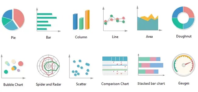
Here’s where teams decide how to display the data. The chart type matters more than most people realize. The wrong visualization can make important trends invisible.
I use these charts based on the data I have:
- Bar or column charts for comparing values (like sales performance across different reps or territories)
- Pie charts or stacked bars for composition data (showing how total revenue breaks down by product line or customer segment)
- Line charts for trends over time (month-over-month growth, pipeline velocity changes)
Pro tip: Need help deciding which reports to build first? Our guide to essential sales reports for leaders breaks down the must-have reports every sales team needs.
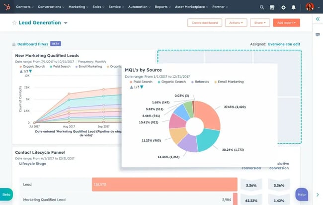
13 Sales Dashboard Examples
Every business has different needs when it comes to sales dashboards, but looking at examples can spark ideas for your own setup. I’ve organized these by use case to make it easier to find what you need.
Performance Tracking Dashboards
Performance-tracking dashboards are your go-to for measuring how well individuals or teams are hitting their sales targets. These are the dashboards teams will check daily or weekly to see if they're on pace, who’s crushing it, and who might need some coaching.
For managers running one-on-ones or a sales representative trying to stay motivated, this is a good place to start. HubSpot’s includes built-in performance tracking reports that let users build these dashboards without any technical setup. Track quota attainment, deal progress, and individual sales metrics right out of the box.
1. Sales Conversion Rate Dashboard
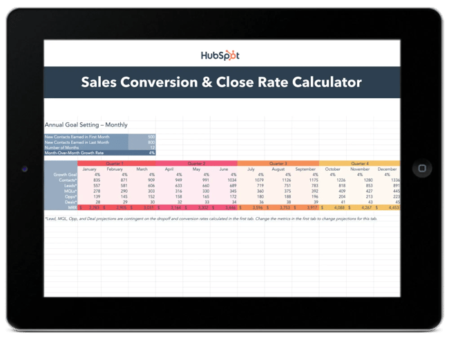
Sales teams use HubSpot’s free to track progress through their entire pipeline. It’s particularly useful for forecasting metrics such as the lead-to-MQL rate and the MQL-to-customer rate.
What we like: The interactive format makes it easy to set goals by month and quarter, giving users a clear view of where deals are converting (or falling through).
Best for: Sales teams looking to diagnose conversion bottlenecks at each funnel stage.
2. Sales Rep Dashboard
Individual performance tracking is crucial for sales reps who want to see their progress. These dashboards include reports for meetings booked, open opportunities, deals in the pipeline, and forecasted revenue.
What we like: These dashboards give reps ownership over their numbers and make it easy to spot when they’re falling behind on activities.
Best for: Individual contributors who want daily visibility into their personal performance and quota progress.
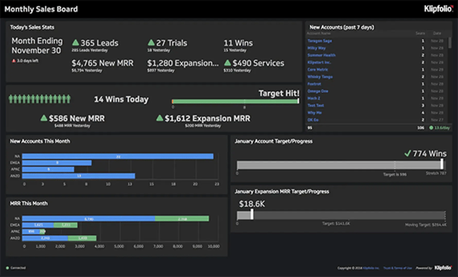
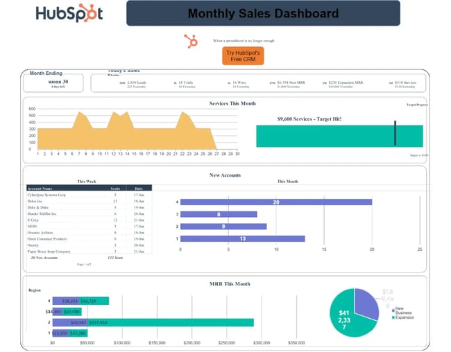
3. Sales Manager Dashboard
Managers need a different view, one that shows team performance at a glance. The best manager dashboards I’ve seen include daily stats alongside monthly progress toward team targets and MRR goals.
What we like: It’s the perfect balance of immediate and long-term visibility, helping managers coach proactively rather than reactively.
Best for: Sales leaders managing 5-20 reps who need to spot coaching opportunities fast.
4. Sales Leaderboard
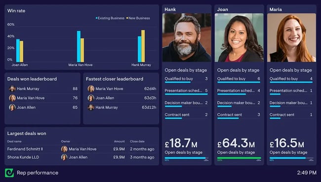
Nothing motivates a competitive sales team like a good leaderboard. These dashboards rank reps by activities completed (calls, emails, meetings), new accounts generated, MRR contributions, and customer retention.
What we like: The visual competition element drives performance, especially for teams motivated by recognition.
Best for: High-energy sales cultures where friendly competition boosts results.
Pro tip: Keep it friendly rather than cutthroat. Celebrate wins publicly, but handle coaching privately.
Activity and Pipeline Dashboards
Activity and pipeline dashboards focus on the work that leads to closed deals. They help teams answer questions like: Are we doing enough outreach? Where are sales opportunities getting stuck? Do we have enough pipeline to hit our sales revenue targets next quarter?
These dashboards are handy during pipeline reviews, forecast calls, and when diagnosing why deals aren’t closing. If your team is working hard but results aren’t following, an activity dashboard will help figure out why.
HubSpot makes this straightforward since all your sales activities (calls, emails, meetings) and deal stages already live in the . You can create custom reports that show exactly how deals flow through your pipeline and which sales activities correlate with wins.
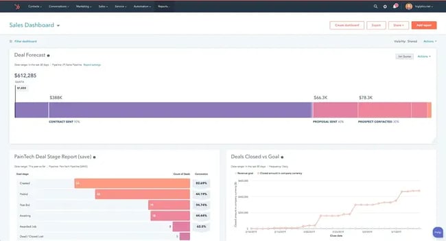
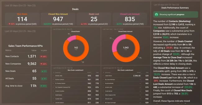
5. Deal Performance Dashboard
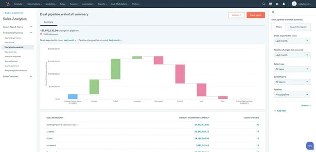
Revenue forecasting reports become much easier when teams can see deals at each stage of the process. I appreciate dashboards that show not just what’s in the pipeline, but how those numbers compare to targets.
What we like: It makes gap analysis much more visual. Users can instantly see if they have enough pipeline to hit next quarter’s goals.
Best for: Sales ops teams and managers focused on accurate forecasting.
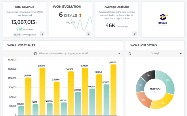
6. Win/Loss Dashboard
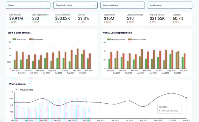
Understanding why deals succeed or fail is critical for improving your sales process. The best win/loss dashboards break down results by deal size, salesperson, and industry.
What we like: They compare your close rates to prior periods or industry benchmarks, providing context for your performance.
Best for: Teams doing regular win/loss analysis and competitive research.
7. Sales Pipeline Dashboard
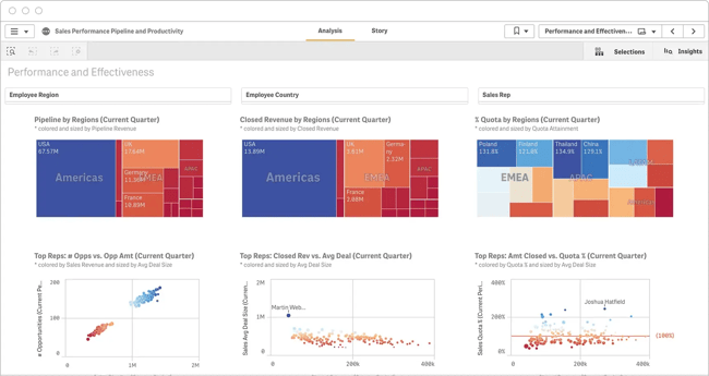
For businesses selling in multiple territories, regional performance dashboards answer key questions. Which regions are performing best? What products sell well where?
What we like: I’ve seen these help companies reallocate resources and identify expansion opportunities based on geographic performance patterns.
Best for: Multi-regional sales teams or companies planning territorial expansion.
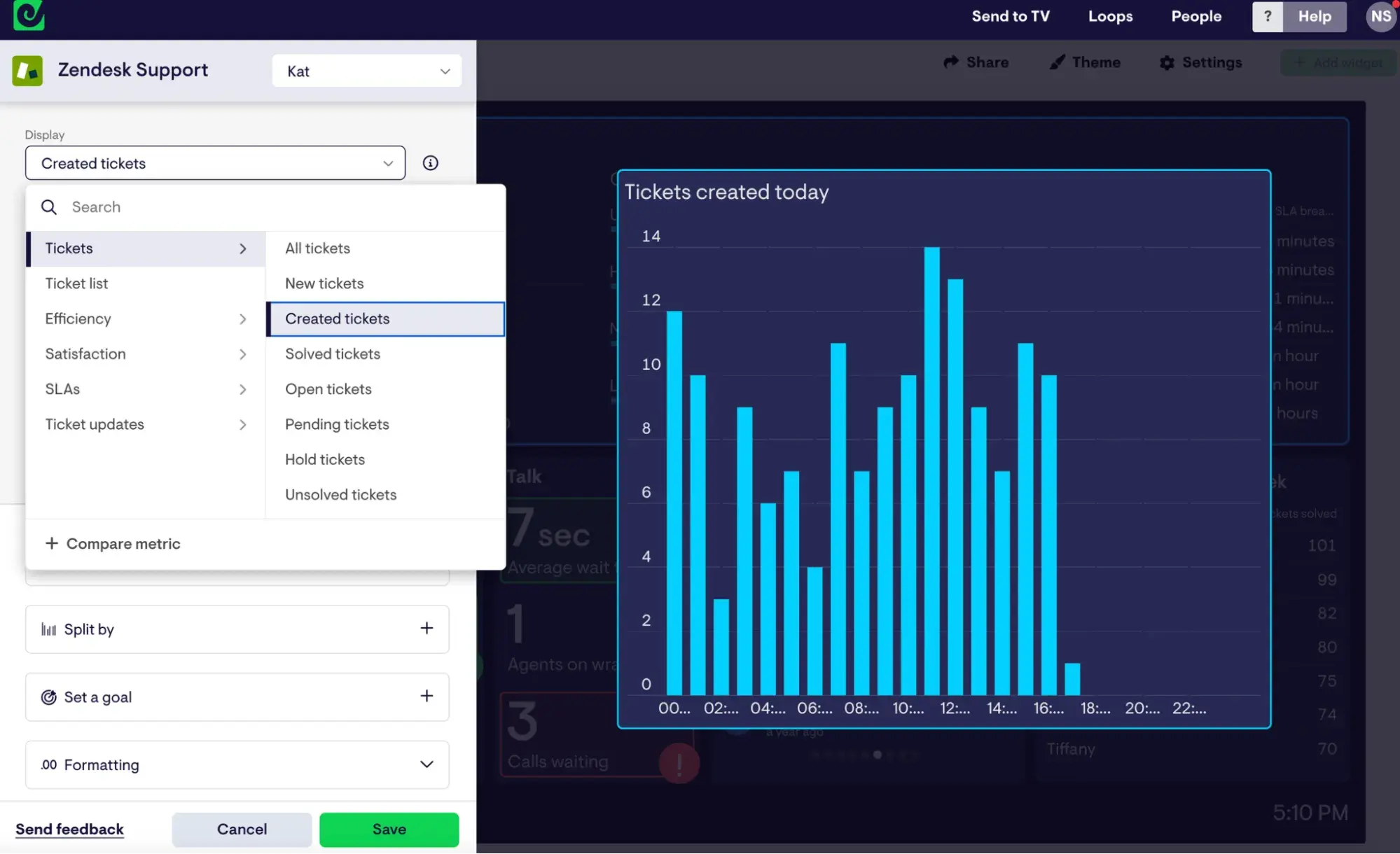
8. Sales Activities Dashboard
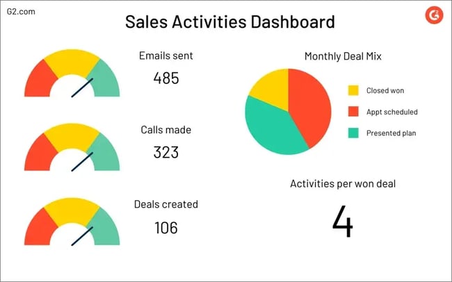
Sales managers often want visibility into what their reps are doing day to day. Activity dashboards track calls, emails, meetings, and demos, often showing the average number of activities needed to win a deal.
What we like: It’s useful for coaching and process improvement. If a rep’s activity is high but results are low, you know to focus on quality rather than quantity.
Best for: Managers coaching reps on daily habits and activity benchmarks.
Strategic and KPI-Focused Dashboards
Strategic dashboards zoom out from daily activities to show the bigger picture. These are the dashboards teams pull up during quarterly business reviews, board meetings, or when making decisions about headcount, territories, or sales strategy.
They focus on the key sales metrics that executives and leadership care about: overall sales revenue, sales growth trends, progress toward annual sales goals, and high-level sales KPIs. The data here is typically aggregated and focused on outcomes rather than activities.
HubSpot’s reporting tools let users build executive-level dashboards that pull from their entire customer platform. Teams can combine sales data with marketing attribution and customer success metrics to give leadership a complete view of the business. If more advanced analytics are needed, and other business intelligence tools.
9. Performance Overview Dashboard
Sometimes teams just want the most important metrics front and center without any clutter. These dashboards prioritize key performance indicators and display them first when the page loads.
What we like: This tool is perfect for daily check-ins. Reps don’t have to spend too much time scrolling or hunting, as they can quickly see the numbers that matter.
Best for: Busy sales leaders who check metrics multiple times a day.
10. Sales Dashboard Template
Goal tracking becomes simpler with sales dashboard templates that sync live data and show progress toward customized targets. Whether tracking by team, opportunity category, or time period, these templates make it easy to spot when reps are falling behind.
What we like: Pre-built templates save hours of setup time and come with best-practice layouts.
Best for: Teams building their first dashboard or those wanting to standardize reporting across regions.
Pro tip: HubSpot’s Data Hub makes it easy to connect multiple data sources to these templates, giving teams a unified view across their entire tech stack.
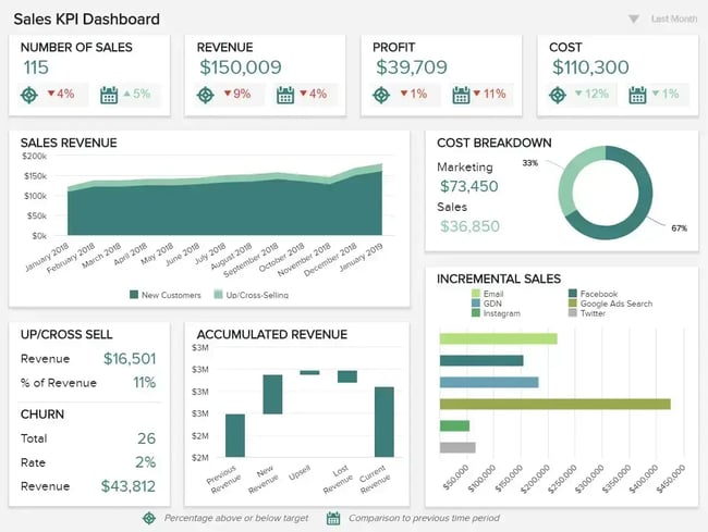
11. Sales KPI dashboard
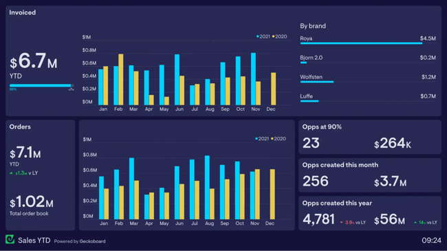
KPI-focused dashboards put the most critical metrics in one place. The most effective ones highlight invoiced income with clear monthly breakdowns, making it easy to spot trends and seasonal patterns.
What we like: The focus on outcomes (revenue, margins, customer lifetime value) rather than just activities keeps teams aligned on what matters.
Best for: Leadership teams tracking business health and strategic progress.
Specialized Dashboards
Specialized dashboards are built for specific audiences, use cases, or business models that require a unique approach.
These might include investor reporting dashboards, board presentation views, or dashboards designed for non-traditional sales processes. They’re also helpful when reps need to combine sales data with information from other departments or external sources.
HubSpot can serve as the foundation for these specialized views, especially when teams connect it with other tools through integrations.
For investor dashboards or highly customized reporting, teams might also consider tools like Visible (for investor communications) or building custom reports that pull HubSpot data into platforms like Power BI dashboards or Google Data Studio.
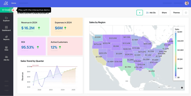
12. Executive Sales Performance Dashboard
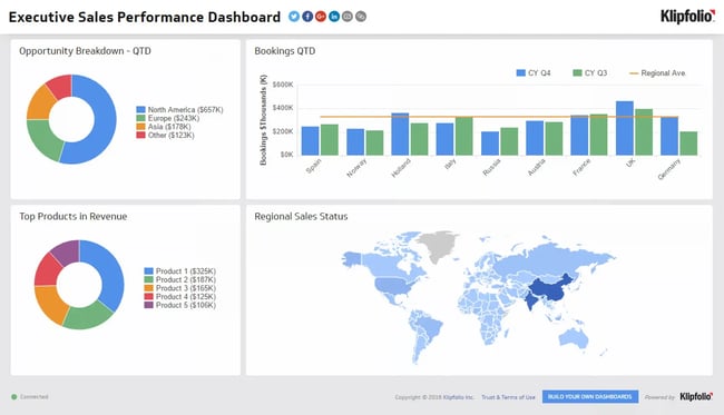
C-level executives need comprehensive views without getting lost in operational details. Executive dashboards typically show opportunities, bookings, and high-level performance metrics that inform strategic decisions rather than day-to-day tactics.
What we like: These follow the 5-second rule to the letter. Executives can grasp overall sales health at a single glance.
Best for: C-suite and board presentations where speed and clarity trump detailed analysis.
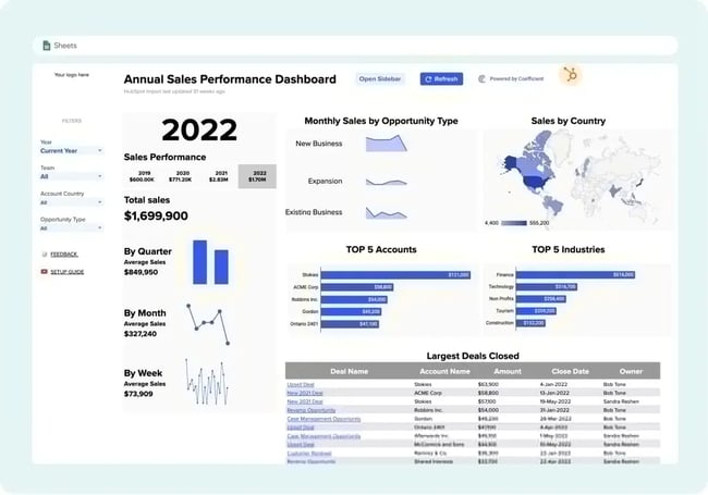
13. Custom Sales Performance Dashboard
Sometimes, none of the templates fit the company’s unique sales process. Custom dashboards let teams build exactly what they need, pulling data from multiple sources and displaying metrics specific to their business model.
What we like: Complete flexibility to match your workflow, terminology, and success metrics.
Best for: Businesses with non-standard sales processes or complex, multi-step buyer journeys.
Pro tip: Start with a template and customize from there rather than building from scratch. It’s faster and you’ll benefit from proven layouts.
What makes a great sales dashboard?
Creating a great sales dashboard is as much an art as it is a science. After years of building and refining dashboards, I’ve learned what separates the ones that transform sales performance from those that collect digital dust.
1. Follow the 5-Second rule
The 5-second rule is simple: anyone looking at your dashboard should understand its main message within five seconds.
I learned this when my first dashboard was so cluttered that people needed 30 seconds just to figure out if things were good or bad.
Decision-makers don’t have time to decipher complex visualizations. They need to glance and immediately know: Are we hitting sales goals? Is revenue up or down? Do we have enough pipeline?
Put your most critical metric in the top-left corner, where eyes naturally go first. Use size and color strategically. Test with fresh eyes.
2. Balance completeness with clarity
Teams often try building an “everything dashboard” that shows every possible metric. It sounds great in theory, but dashboards that show everything create chaos and clutter rather than clarity.
Before building, talk to the people who’ll use it. Ask sales representatives: What numbers do you check most often? Which metrics actually change your behavior? How specific do these need to be?
Start with user stories. What decisions will someone make using this dashboard? If you can’t connect a metric to a specific action, it probably doesn’t belong.
Use progressive disclosure. Show summary metrics first, with the ability to drill down for details. Think of it like a newspaper — headline, summary, then full story.
Embrace white space. A cluttered dashboard overwhelms users. Better to have multiple focused dashboards than one confusing mega-dashboard.
3. Ensure adoption across your team
Beautiful dashboards mean nothing if your team doesn’t use them. Getting actual adoption requires a strategy.
Start by solving a real pain point. When a dashboard saves someone 10 minutes of manual work, they’ll use it. Make it part of the workflow by embedding it where people already work (email updates, Slack integrations, CRM homepage).
Create rituals around the data, like Monday pipeline reviews or weekly check-ins.
Train people properly and get leadership buy-in. When the CEO references the dashboard in decisions, everyone notices. Keep data fresh and accurate because nothing kills trust faster than wrong numbers.
4. Do the math for people
I learned this lesson when I was constantly calculating month-over-month growth in my head every time I looked at my revenue numbers. It was annoying and slowed me down.
Now I include calculated fields whenever possible. Instead of showing raw numbers that require mental math, I show the percentage change, the variance from target, or whatever calculation people need.
For example, rather than displaying “Revenue: $45,000” and “Last Month: $38,000,” I show “Revenue: $45,000 (+18% vs last month).” It’s a small change that saves time and prevents misinterpretation.
5. Think about who else needs to see this
I used to build dashboards just for myself, but I’ve realized that sharing visibility can improve performance. When sales reps can see the same metrics that leadership tracks, they understand the situation from leadership's perspective.
This doesn’t mean giving everyone access to everything, but transparency about goals and key metrics helps align effort. If leadership cares about customer lifetime value, make sure the team can see those numbers too.
I’ve seen teams improve significantly just by making their targets and progress visible to everyone, not just managers.
6. Don’t overcomplicate
My biggest dashboard mistake was trying to show everything at once. Revenue, activities, conversion rates, pipeline velocity, deal sizes, forecasts. You name it, I crammed it in there. The result was a beautiful mess that nobody wanted to use.
For example, one of my favorite sales tracking tools is HubSpot’s free Sales Metrics Calculator. This Excel template is simple and easy to use, offering key information such as average deal size, win-loss rate, and churn rate, without overwhelming me with unnecessary data and charts.
Steve Harlow, chief sales officer at prospecting tool , calls this the golden rule: “Dashboard reports must drive action. If a metric doesn’t inform a decision or behaviour, it’s just noise. Simplicity and visibility make a dashboard a real asset, not how many metrics you can cram in.”
I’ve found this to be absolutely true. The best dashboards I use now answer specific questions:
- Am I on track to hit my monthly target?
- Which prospects need follow-up?
- Where are deals getting stuck?
Everything else is secondary.
7. Build for your actual users
I used to build dashboards based on what I thought people should want to see, rather than what they needed. Big mistake.
, founder of agency growth consultancy , makes a great point about this: “I believe a great dashboard is one that provides useful data to both the sales manager and all of the sales team. If they can look at it and understand how it can help them improve, then you’re on track to grow a more empowered and high-performing team.”
This means thinking carefully about who will use your dashboard and how they will use it. A sales rep tracking their own performance needs different information than a VP forecasting quarterly revenue. Don’t try to make one dashboard serve everyone.
8. Focus on what you can control
When my revenue dipped last year, staring at declining numbers didn’t help me fix the problem. What helped was tracking the activities that led to revenue: outreach emails sent, follow-up calls made, and proposals delivered.
As Newton-Temperley puts it: “In times of low sales, the biggest help to a salesperson is focusing on the elements that they can control. By increasing the inputs, there is surely a path to the results improving too.”
Harlow takes a similar approach: “We track leading indicators like response rates and booked meetings, as well as lagging metrics like pipeline velocity, conversion rates, and revenue per rep. This mix helps us spot bottlenecks early and coach the team proactively.”
9. Make it accessible
A dashboard sitting in some forgotten corner of the team’s CRM isn’t helping anyone. Think about how people will access and use the information.
Some teams need daily email updates with key metrics. Others want dashboards embedded in their project management tools. The key is meeting people where they already are, rather than expecting them to remember to check another tool.
HubSpot’s Sales Analytics software makes this easy with scheduled reports and mobile access, so teams can check performance from anywhere.
Frequently Asked Questions about Sales Performance Dashboards
What is the 5-second rule for sales dashboards?
The 5-second rule states that users should be able to understand the dashboard’s main message within 5 seconds of viewing it. If a dashboard is so cluttered or complex that someone needs more time to figure out what’s important, it’s not designed well.
This rule is especially critical for executive dashboards where leaders need to grasp sales health at a glance.
What are the five key performance indicators in sales?
The five key performance indicators most sales teams should track are:
- Pipeline velocity (how fast deals move through stages)
- Conversion rates (percentage of leads becoming customers)
- Average deal size (typical contract value)
- Sales cycle length (time from first contact to close)
- Activity metrics (calls, emails, meetings that correlate with wins)
These KPIs provide a balanced view of both leading indicators (activities) and lagging indicators (revenue outcomes).
What does a good sales dashboard look like?
A good sales dashboard is clean, focused, and role-specific. It displays only the metrics that drive decisions for its intended user. The layout follows a logical hierarchy with the most important information in the top-left corner.
Charts are simple and easy to interpret. Most importantly, it answers specific questions without requiring users to dig for information or do mental math.
How often should I update my sales dashboard?
Most effective sales dashboards update in real time or at least daily. This is possible when dashboards connect directly to live data sources like a CRM.
Real-time updates are significant for sales reps and managers who make daily decisions based on current pipeline status.
Executive dashboards can update less frequently (weekly or monthly) since they focus on trends rather than daily activities.
What’s the difference between a sales dashboard and a sales report?
A sales dashboard provides real-time visual snapshots of key metrics, designed for quick consumption and frequent checking.
Sales reports are more detailed documents that analyze performance over a specific period, often including commentary, context, and recommendations.
Dashboards answer “What's happening right now?” while reports answer “What happened and why?” Both serve important but different purposes in sales operations.
Getting started with your sales performance dashboard
Your first dashboard doesn’t have to be perfect. In fact, it shouldn’t be.
Start with the metrics tracked manually. The numbers checked every Monday morning or pulled together for weekly meetings. Build those into a basic dashboard and use it for a month.
Teams quickly discover what’s missing and what’s not as useful as they thought. For example, conversion rate by traffic source might prove unnecessary, while visibility of deals stuck in “proposal sent” for more than two weeks becomes urgent.
The goal is to replace manual processes with solutions that save time and give clearer visibility into sales performance. Every business is unique, and dashboards should reflect that.
Free Sales Metrics Calculator
A free, interactive template to calculate your sales KPIs.
- Average Deal Size
- Customer Acquisition Cost (CAC)
- Customer Lifetime Value (CLV)
- And more!
Download Free
All fields are required.
Form not available
You're all set!
Click this link to access this resource at any time.


![Want to create a sales plan? Let me show you how [+8 sales plan examples]](https://53.fs1.hubspotusercontent-na1.net/hubfs/53/sales-plan-1-20260323-5097831.webp)


![10 Important Sales Analysis Reports [+ 4 Sales Report Templates]](https://53.fs1.hubspotusercontent-na1.net/hubfs/53/Sales-Analysis-Reports-1-20241007-6831164.webp)
![Sales metrics: What to track, how to track, & why [expert tips]](https://53.fs1.hubspotusercontent-na1.net/hubfs/53/Sales-metrics-1-20251030-6874232.webp)